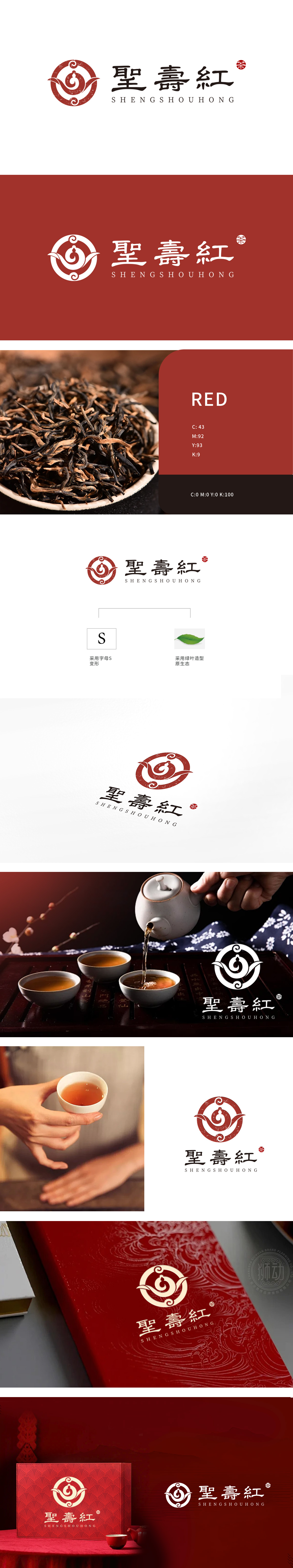
狮动设计以字母“S”为创意起点,通过流畅的曲线变形,图形上半部分如飘逸的茶壶壶嘴,下半部分似杯中旋转上升的茶汤热气,线条圆润舒展,既呼应了“茶”的饮用场景,又传递出品牌名称中“聖”(尊贵、典雅)与“壽”(温润、悠长)的文化气质,字整体造型简洁而富有故事性。一叶入印,红韵千年,更是传统美学的现代转译。
Lion Design takes the letter "S" as the creative starting point, and through smooth curve deformation, the upper part of the figure is like an elegant teapot spout, and the lower part is like the rising hot air of tea soup in a cup. The lines are round and stretched, which not only echoes the drinking scene of "tea", but also conveys the cultural temperament of "saint" (noble and elegant) and "longevity" (warm and long) in the brand name, and the overall shape of the word. A leaf in print, with a thousand years of red rhyme, is a modern translation of traditional aesthetics.


扫码或拨打添加客服微信


