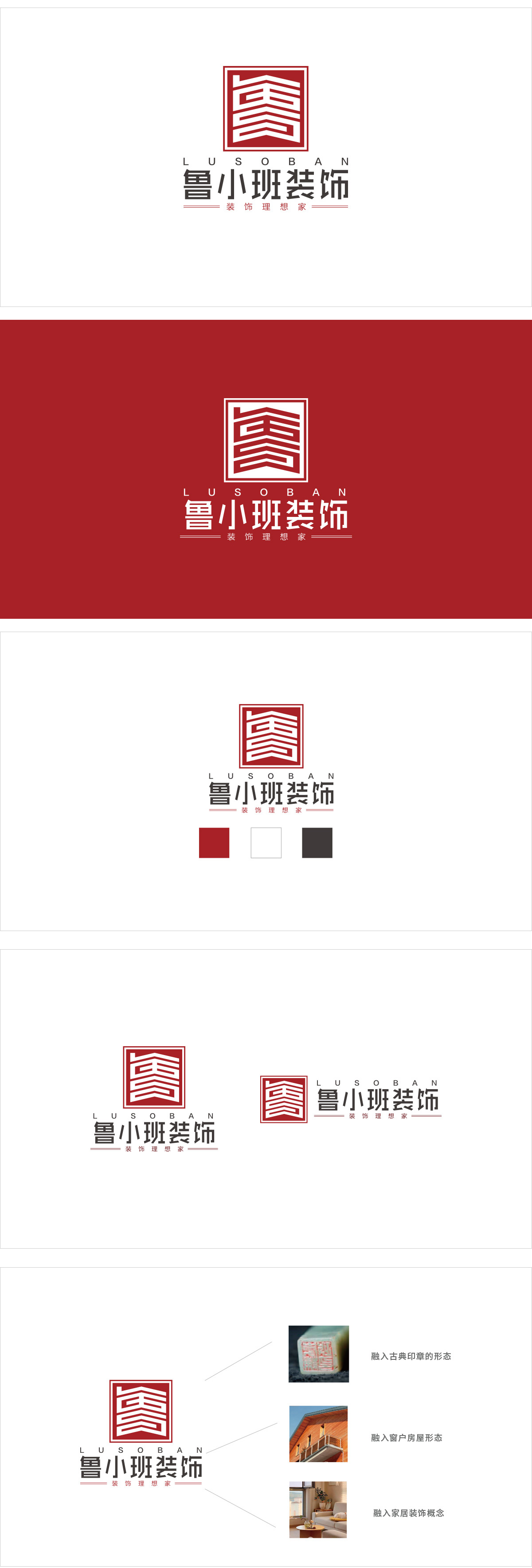
狮动设计以“鲁”字为原型变形,通过折角与层次感模拟出“屋顶”“房梁”的轮廓——既保留了地域标识,又用建筑元素点出“装饰”的行业属性,实现了“文字+图形”的完美融合。线条的层层叠加像“楼层”“墙面”的抽象化,配合方形的“框架感”,直接传递“装修”“构建家”的核心业务,红色是中国传统文化中“喜庆、温暖、可靠”的象征,符合“家”的情感属性;方形则代表“稳重、踏实”,暗合装饰行业“靠谱、放心”的核心诉求,整体标志传递出这是“一个靠谱的装饰公司,能帮我装出理想中的家”。
Lion Design takes the word "Lu" as the prototype, and simulates the outline of "roof" and "beam" through folding angle and layering, which not only retains the regional logo, but also points out the industrial attribute of "decoration" with architectural elements, realizing the perfect integration of "text+graphics". The layering of lines is like the abstraction of "floor" and "wall", which directly conveys the core business of "decoration" and "building home" with the square "sense of frame". Red is the symbol of "jubilation, warmth and reliability" in China traditional culture and accords with the emotional attribute of "home". The square represents "steadiness and sureness".


扫码或拨打添加客服微信