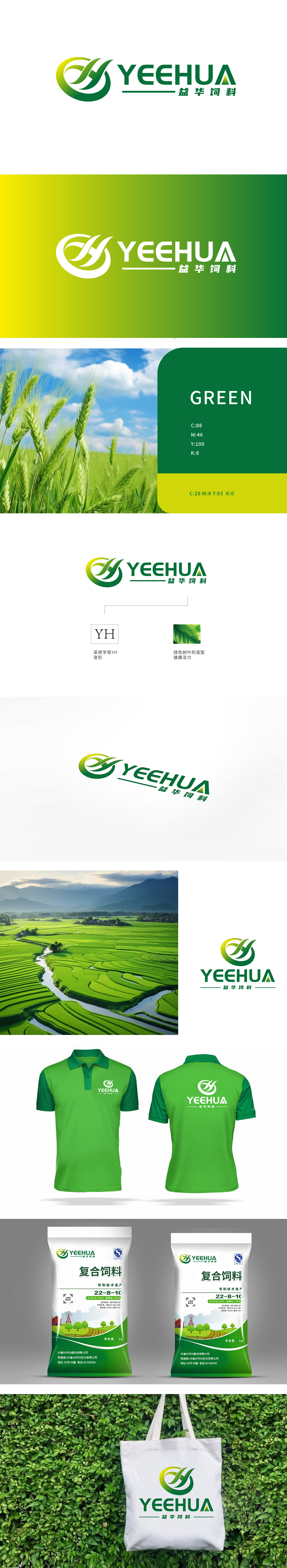
狮动设计以品牌名称首字母“YH”为创意起点,通过流畅的曲线将“Y”与“H”巧妙连接,形成环绕式动态造型。传递积极向上的品牌生命力,融入“绿色树叶”意象,绿色作为饲料行业的核心色彩,既代表天然原料、生态养殖,也传递“安全、健康”的产品属性,符合饲料品牌对动物营养与食品安全的价值主张。整体从字母到图形的创意转化,让品牌拥有专属视觉资产,用自然元素隐喻产品价值。
Lion Design takes the initial letter "YH" of the brand name as the creative starting point, and skillfully connects "Y" and "H" through smooth curves to form a circular dynamic modeling. It conveys the positive brand vitality and incorporates the image of "green leaves". As the core color of the feed industry, green not only represents natural raw materials and ecological farming, but also conveys the product attributes of "safety and health".


扫码或拨打添加客服微信


