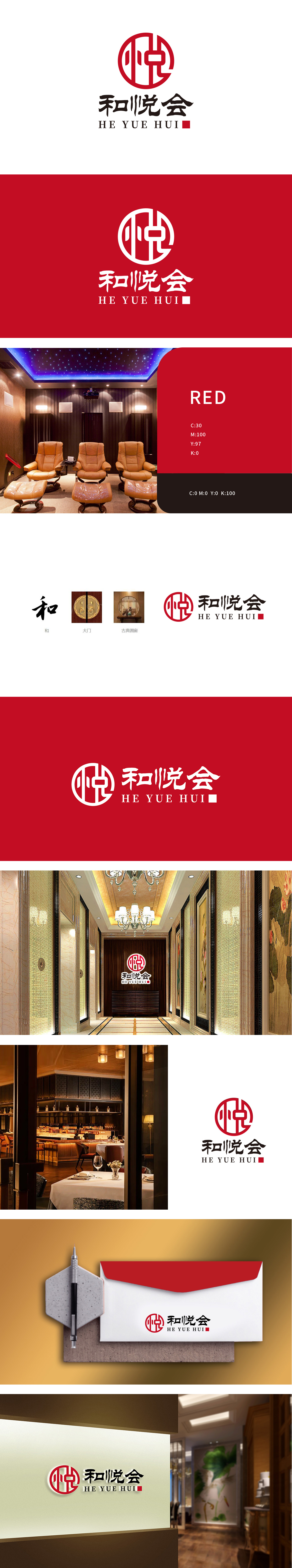
狮动设计以“悦”字篆体的笔画如窗棂交错,传递出中国传统文化中“和谐、中正、从容”的理念,形成传统为骨、创新为魂”的体验主张,圆形窗棂的元素,圆形在中国文化中代表“圆满、包容”,强化“东方美学沉浸式体验”的核心卖点。LOGO主色选用高饱和“宫墙红”,如同历经岁月的朱漆大门,从而打造以东方美学为载体,提供“和谐、愉悦”的高品质休闲空间。
Lion Design uses the strokes of "Yue" as a window lattice, conveying the concept of "harmony, righteousness and calmness" in China traditional culture, and forming the experience proposition that tradition is the bone and innovation is the soul. The elements of circular window lattice represent "completeness and tolerance" in China culture, which strengthens the core selling point of "oriental aesthetic immersive experience".


扫码或拨打添加客服微信


