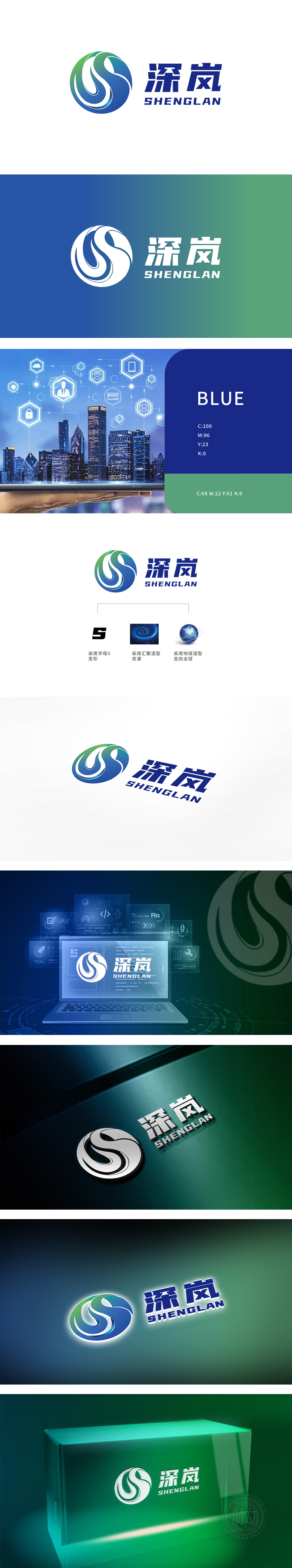
狮动设计以品牌名称首字母“S”为视觉起点,通过流畅的曲线旋转化为螺旋上升的动态造型,打破静态字母的刻板印象。绿色渐变到蓝色渐变的色彩过渡,既象征“深岚”从“扎根本土”(绿色:自然、稳健)到“科技赋能”(蓝色:创新、专业)的发展路径,又通过螺旋形态强化“资源汇聚、能量流动”的概念。整体以“汇聚·全球·科技”为核心概念,通过图形、色彩与符号的融合传递全品类覆盖”品牌定位。
Lion design takes the initial letter "S" of the brand name as the visual starting point, and transforms it into spiral dynamic modeling through smooth curve rotation, breaking the stereotype of static letters. The color transition from green gradient to blue gradient not only symbolizes the development path of "Deep Lan" from "rooted in the native land" (green: natural and steady) to "technological empowerment" (blue: innovative and professional), but also strengthens the concept of "resource convergence and energy flow" through spiral form. Overall.


扫码或拨打添加客服微信


