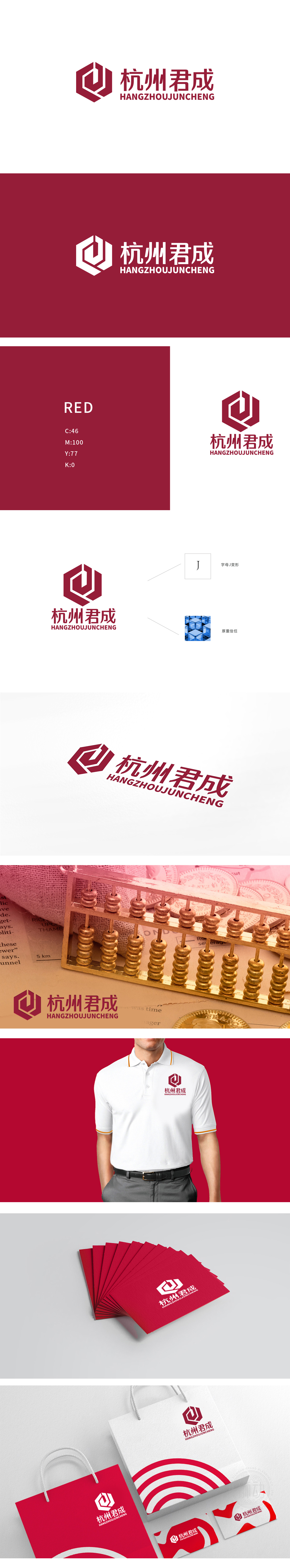
狮动设计以首字母“J”,通过流畅的曲线与六边形轮廓融合,既保留字母识别性,又以环绕式线条传递“守护”“包容”的意象,暗合金融服务中“为客户资产保驾护航”的价值主张。六边形是自然界中最稳定的几何结构,在LOGO中象征金融财务行业的“稳定性”“结构性”和“风险控制能力”,契合企业稳健经营的核心诉求。整体通过几何图形、字母变形与色彩的组合,将“稳定、专业、信任、增长”四大金融行业关键词转化为可视化符号,便于客户快速建立“可靠金融伙伴”的品牌联想。
Lion Design uses the initial letter "J", and combines the smooth curve with the hexagonal outline, which not only retains the letter recognition, but also conveys the image of "guarding" and "containing" with the surrounding lines, which coincides with the value proposition of "escorting customers' assets" in financial services. Hexagon is the most stable geometric structure in nature, which symbolizes the "stability", "structure" and "risk control ability" of the financial industry in the LOGO, which is in line with the core demands of the stable operation of enterprises.


扫码或拨打添加客服微信


