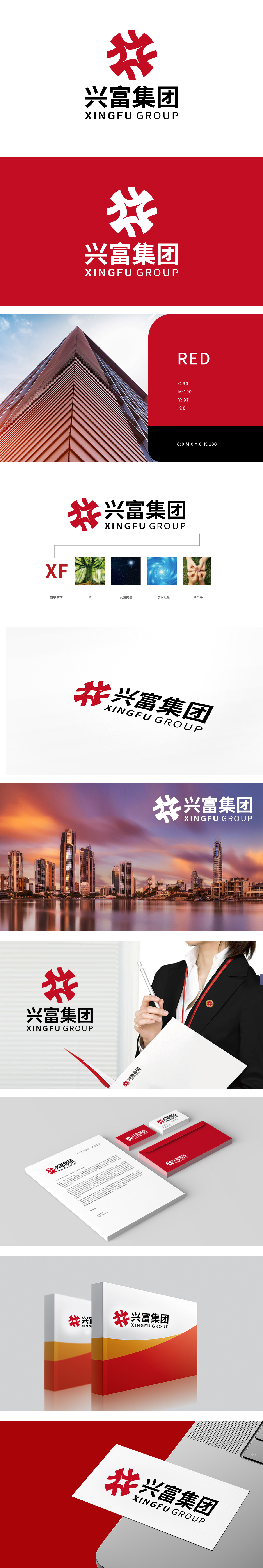
狮动设计将首字母“X”与“F”的变形融合:使文字符号图形化,强化品牌专属记忆点。树”的意象,传递企业如同大树般扎根基础、生生不息、稳健发展的成长力,以及对可持续发展的追求。“闪耀的星”呼应,既突出品牌在行业中的核心地位与标杆价值,也寓意企业如星辰般照亮前路,引领行业发展方向,传递自信与愿景感。从“元素拆解”到“意义共生”,形成“聚合成长、卓越引领”的整体品牌联想,完美契合“综合型企业”的多元性与整体性。
Lion design combines the deformation of the initials "X" and "F": it makes the text symbols graphical and strengthens the brand-specific memory points. The image of "tree" conveys the growing power of the enterprise, which is rooted in the foundation like a big tree, endless and steady development, and the pursuit of sustainable development. The echo of "shining star" not only highlights the core position and benchmarking value of the brand in the industry, but also implies that enterprises light up the road ahead like stars, lead the development direction of the industry, and convey self-confidence and vision.


扫码或拨打添加客服微信


