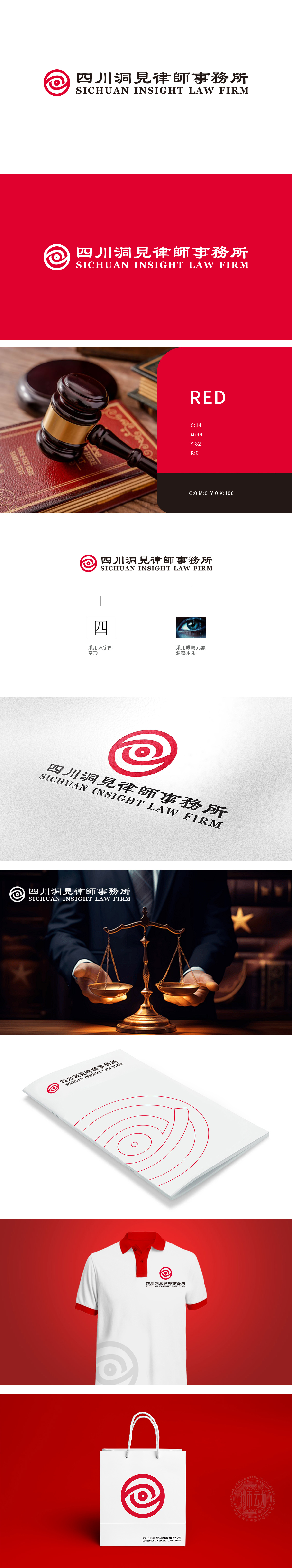
狮动设计以红色圆形为基底,内部嵌套多层线条构成抽象化“眼睛”意象——外层环形线条模拟“法袍”或“法律圆环”的庄严感,象征法律的公正与权威;中部螺旋状曲线向内聚焦,形成瞳孔的视觉中心,既是“洞察”的直观表达,也隐喻律师对案件本质的深度剖析能力。红色作为主色调,传递专业、信任感与权威性,符合法律服务行业的严谨属性。设计理念与行业属性的契合,“洞察本质”的概念落地,打造了兼具行业辨识度、地域关联性与品牌主张的LOGO。
Lion design is based on the red circle, and the inner nested multi-layer lines constitute the abstract "eye" image-the outer ring lines simulate the solemn feeling of "robe" or "legal circle", symbolizing the justice and authority of the law; The spiral curve in the middle focuses inward to form the visual center of the pupil, which is not only an intuitive expression of "insight", but also a metaphor for the lawyer's ability to deeply analyze the nature of the case. As the main color, red conveys professionalism, trust and authority, which conforms to the rigorous attributes of the legal .


扫码或拨打添加客服微信


