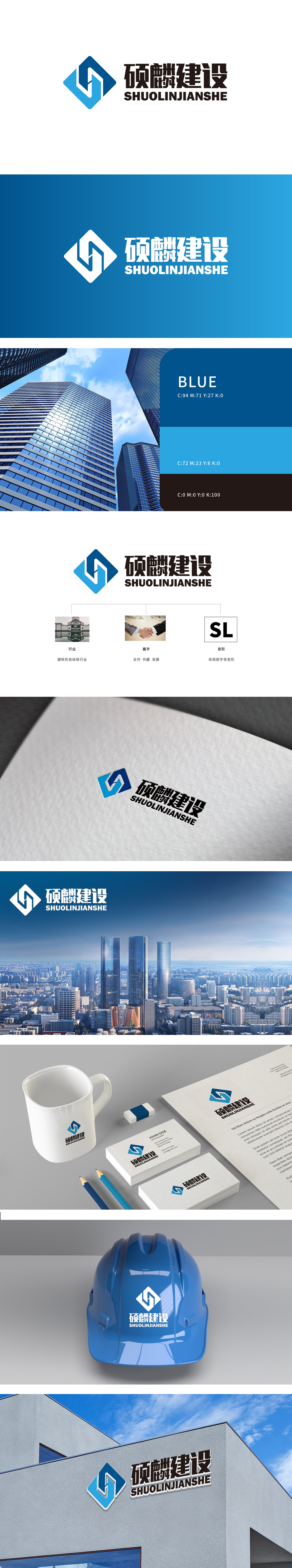
狮动设计采用首字母“SL”为创意原点,通过几何化变形构建核心视觉符号。蓝色“L”与“ S”的流线型曲线形成环抱结构,整体呈现出稳定与动态的平衡——竖线象征建筑的垂直挺拔,曲线则暗示协作的灵活性,符合建筑行业“结构严谨+创新突破”的双重特质。色彩寓意:蓝色渐变,蓝色在行业中常与“专业、可靠、信任”关联,既呼应建筑工程的稳重属性,结构化美学与行业适配结构化,采用对称平衡的菱形外框,内部线条简洁有力,符合建筑行业“理性、高效、精准”的职业形象。同时,菱形在视觉上具有“稳固感”和“向上延伸感”,暗合企业“追求卓越、稳步发展”的品牌愿景。
Lion design uses the initial letter "SL" as the creative origin, and constructs the core visual symbol through geometric deformation. The streamlined curves of blue "L" and "S" form an embracing structure, which shows a balance between stability and dynamics as a whole-the vertical line symbolizes the vertical height of the building, while the curve implies the flexibility of cooperation, which conforms to the dual characteristics of "rigorous structure+innovation breakthrough" in the construction industry. Color implication: Blue is gradually changing, and blue is often associated with "professionalism, reliability and trust" in the industry.


扫码或拨打添加客服微信


