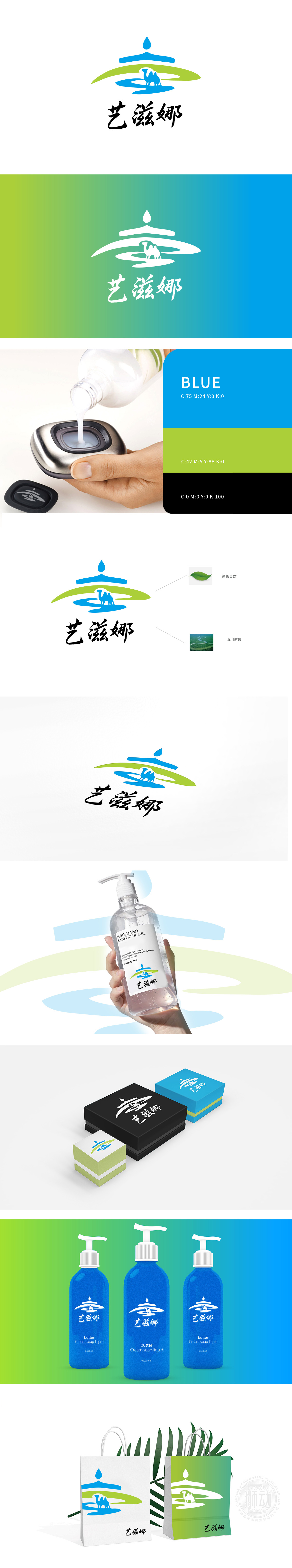
狮动设计采用水滴象征纯净、保湿,契合护肤品“补水、滋养”的核心功能;流畅的弧形线条模拟肌肤轮廓,传递温和、亲肤的产品属性。蓝色在日化领域常关联“天然、安全”,与护肤品强调的“无添加、纯净配方”认知一致,增强消费者信任感。绿色代表“天然、有机”,呼应护肤品对“植物萃取、自然成分”的卖点;蜿蜒的蓝色河流与绿色山峦结合,形成“山水共生”的画面,暗喻产品原料源自自然、生态纯净。骆驼作为沙漠生命力的象征,传递“坚韧、耐受、深层滋养”的产品联想,通过自然符号的创新组合(骆驼+山水+水滴),共同构建“天然滋养的艺术”品牌调性。
Lion design symbolizes purity and moisture, which is in line with the core function of "hydrating and nourishing" of skin care products; Smooth curved lines simulate skin contours and convey gentle and skin-friendly product attributes. Blue is often associated with "nature and safety" in the field of daily chemical products, which is consistent with the cognition of "no additive and pure formula" emphasized by skin care products and enhances consumers' trust. Green stands for "natural and organic", echoing the selling point of skin care products for "plant extraction and natural ingredients"; The winding blue river and green mountains combine to form a picture of "landscape symbiosis".


扫码或拨打添加客服微信


