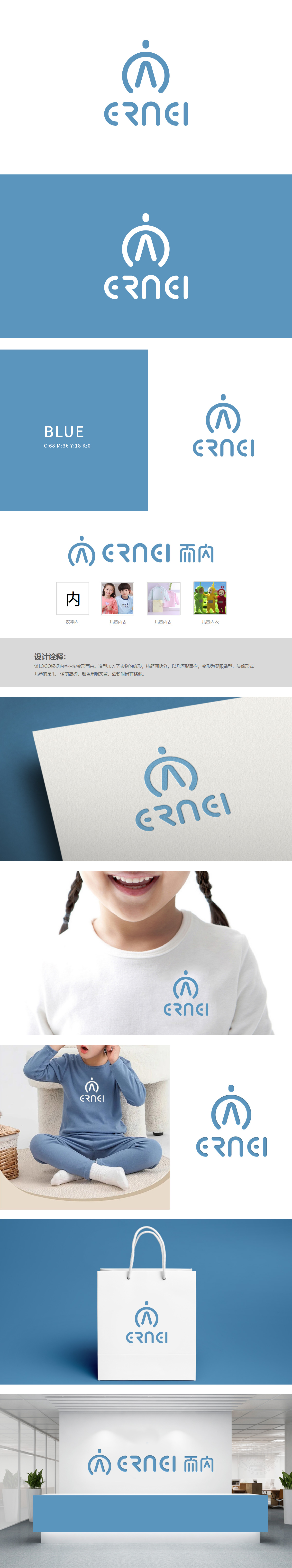
狮动设计以汉字“内”为创意原点,结构拆解与重构:将“内”字笔画拆分后,以几何线条(圆形、弧形、直线)重组,既保留汉字识别性,又赋予现代设计感,符合儿童产品“简洁易记”的传播需求。衣物廓形的融入:直观关联儿童内衣的产品属性,实现“图形即品类”的视觉传达。蓝色象征“纯净、舒适、安全”,贴合家长对儿童内衣“无刺激、亲肤”的核心诉求;低明度处理避免视觉冲击,营造柔和、温馨的氛围,整体通过对“内”字的解构与童趣化重塑,成功为“而内”品牌打造了兼具“品类识别性、儿童亲和力、高端简约感”的视觉符号。
Lion Design takes the Chinese character "nei" as the creative origin, and its structure is disassembled and reconstructed: after the strokes of "nei" are split, they are reorganized with geometric lines (circle, arc and straight line), which not only retains the recognition of Chinese characters, but also gives modern design sense, which meets the communication needs of children's products that are "simple and easy to remember".The integration of clothing silhouette: intuitively relate the product attributes of children's underwear, and realize the visual communication of "graphics are categories". Blue symbolizes "purity, comfort and safety".


扫码或拨打添加客服微信


