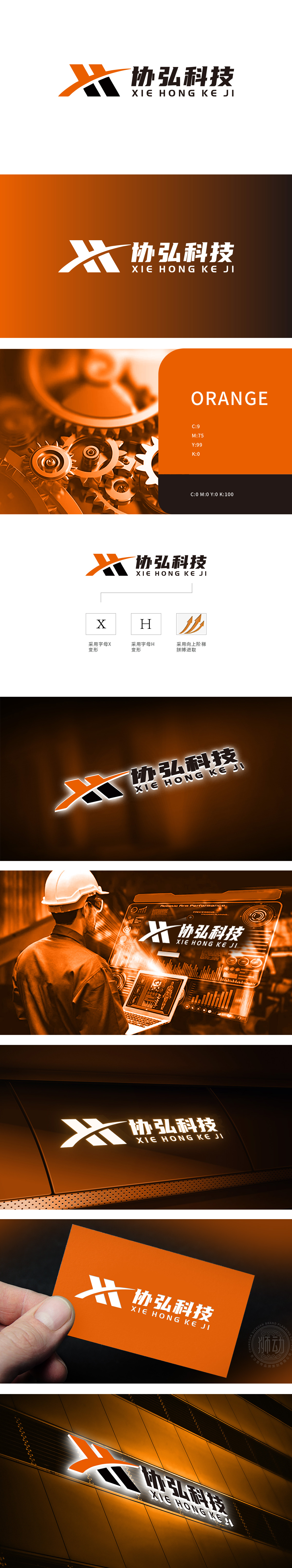
狮动设计由品牌名称首字母“X”(协)和“H”(弘)变形构成,通过硬朗的直线切割与斜向交叉结构,形成类似重工机械中“齿轮啮合”“臂架交错”的视觉联想,传递工业属性的稳固与精密。黑色与橙色的对比:黑色块象征重工机械的钢铁质感与专业性,橙色斜线穿插其间,注入科技活力与突破感,“重”在实力根基,“科”在创新突破,图形与色彩的双重逻辑精准匹配行业特质。成功为协弘科技打造了兼具“重工机械工业质感”与“科技企业创新活力”的视觉符号。
Lion Design consists of the brand name initials "X" (Xie) and "H" (Hong). Through tough straight-line cutting and oblique cross structure, it forms a visual association similar to "gear meshing" and "arm frame crossing" in heavy machinery, conveying the stability and precision of industrial attributes. Contrast between black and orange: black blocks symbolize the steel texture and professionalism of heavy machinery, and orange diagonal lines are interspersed among them, injecting scientific and technological vitality and breakthrough. "Emphasis" is on the strength foundation, "science" is on innovation and breakthrough, and the dual logic of graphics and color accurately matches the characteristics of the industry. Successfully created a visual symbol for Xiehong Technology.


扫码或拨打添加客服微信


