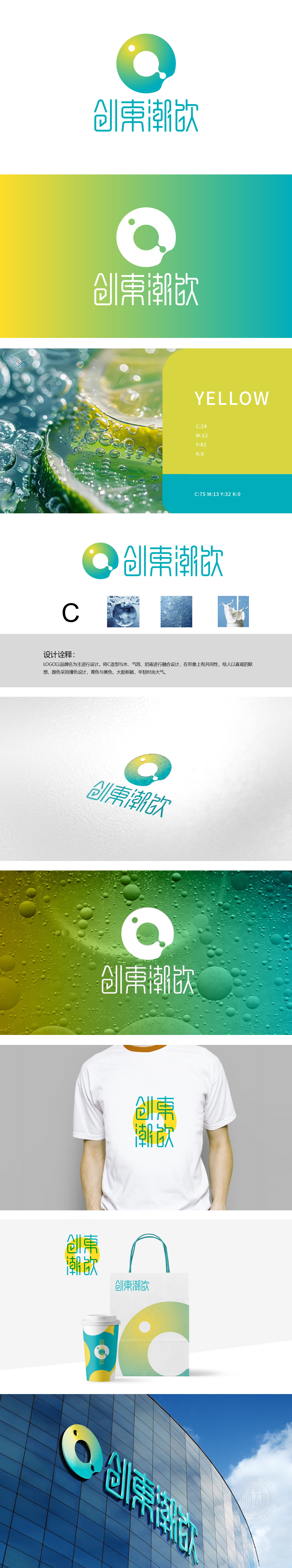
狮动设计以首字母“C”,通过液态流动的边缘曲线(右侧滴落的“液滴”元素),直观传递饮料的“流动性”与“液态属性”。环形内的白色负空间如同饮品杯口或气泡,强化“饮品”品类认知。冷暖色碰撞打破传统饮料品牌的单一色调,既符合“潮饮”的年轻定位,又通过色彩心理学强化“多元饮品”的包容性,将抽象的“饮料”品类属性转化为直观的视觉语言。既满足了品牌“创東潮饮”年轻、潮流的定位,又通过与水、气泡、奶液的深度融合,让消费者“一看就懂是饮料,一看就想尝味道”,充分展现了狮动设计在“品牌符号与品类属性精准对接”上的专业能力,用视觉讲透“饮料”本质
Lion design uses the initial letter "C" and the edge curve of liquid flow (the "droplet" element dripping on the right) to convey the "fluidity" and "liquid property" of the beverage intuitively. The white negative space in the ring is like a drink cup mouth or bubble, which strengthens the recognition of "drink" category. The collision of cold and warm colors breaks the single color tone of traditional beverage brands, which not only conforms to the young orientation of "tide drink", but also strengthens the inclusiveness of "multiple drinks" through color psychology, and transforms the abstract category attributes of "drinks" into intuitive visual language.


扫码或拨打添加客服微信


