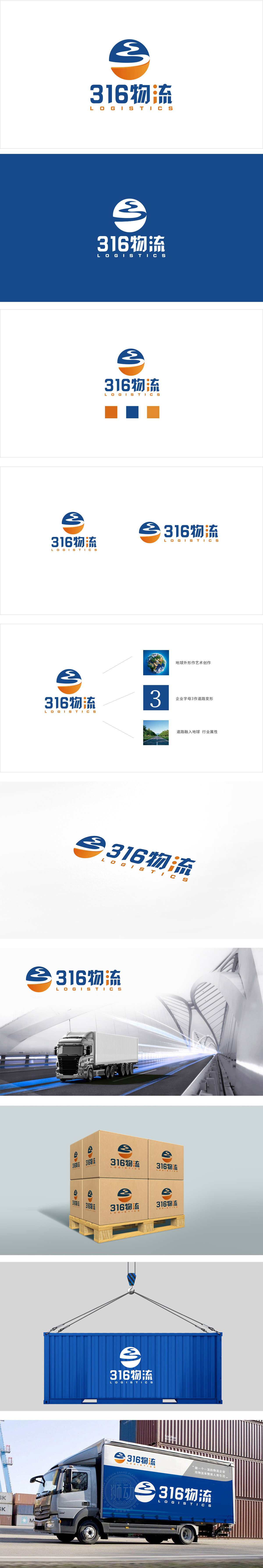
狮动设计采用上下两个半圆组合而成,形成一个“近似完整的圆”,隐含“闭环”“全面覆盖”的含义。河流:象征“流动”“流通”,直接关联物流的“运输”本质;道路:象征“交通网络”,暗示公司的物流线路覆盖广、链路完善。大地:象征“稳定”“根基”,呼应物流“可靠交付”的核心需求;太阳:象征“活力”“温暖”,传递公司“高效、贴心”的服务理念。通过图形(河流/道路+圆形)、颜色(蓝=专业+橙=活力)、文字(316=易记+物流=行业属性)的协同,成功传递了“可靠、高效、覆盖广”的物流品牌形象。
Lion design is composed of upper and lower semicircles, forming an "approximately complete circle", which implies the meaning of "closed loop" and "full coverage". River: a symbol of "flow" and "circulation", which is directly related to the "transportation" essence of logistics; Road: symbolizes "traffic network", implying that the company's logistics lines cover a wide range and the links are perfect. Earth: symbolizes "stability" and "foundation" and echoes the core demand of "reliable delivery" of logistics; Sun: symbolizes "vitality" and "warmth" and conveys the company's "efficient and caring" service concept.


扫码或拨打添加客服微信


