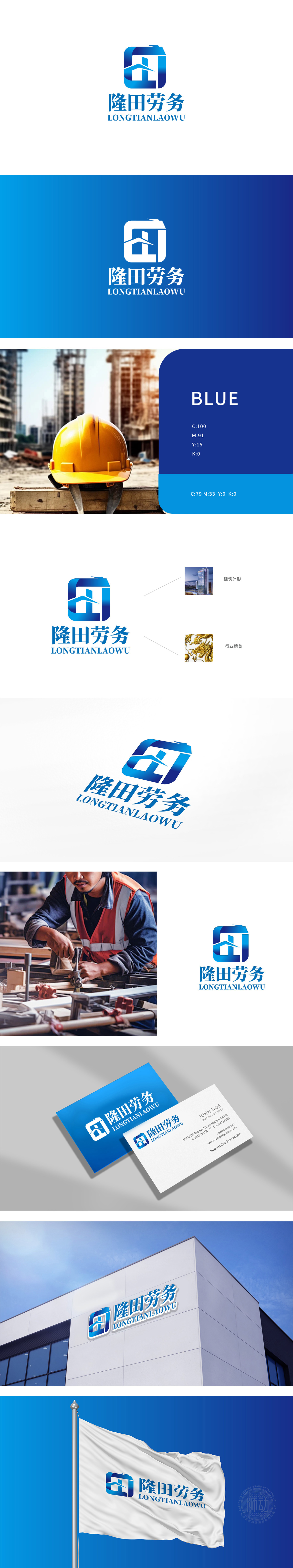
狮动设计采用屋顶/高楼”倾斜线条与下方的垂直结构,明确呼应建筑劳务行业属性,抽象化呈现“房屋”“楼宇”的形态特征,传递行业专注度,中间的“人”字轮廓,既代表“人力”核心资源,也象征劳务团队的支撑力与向上生长的活力,契合人力资源服务的本质。方形框架的稳定感:外框的方形设计传递稳重、可靠的企业形象,符合建筑行业对安全、规范的要求,也隐喻公司在行业中的坚实基础。以“人力”为脊梁,用“建筑”筑根基,将“人”的价值与“建筑”的力量刻入品牌基因,点燃人力资源与建筑劳务行业的视觉共鸣!
Lion Design adopts the sloping lines of the roof/high-rise building and the vertical structure below, clearly echoing the attributes of the construction labor service industry, abstractly presenting the morphological characteristics of "house" and "building" and conveying the industry concentration. The outline of "human" in the middle not only represents the core resources of "human resources", but also symbolizes the support and upward growth vitality of the labor service team, which is in line with the essence of human resources service. The sense of stability of the square frame: the square design of the outer frame conveys a stable and reliable corporate image, which meets the requirements of safety and standardization in the construction industry and also symbolizes the firm foundation of the company in the industry.


扫码或拨打添加客服微信


