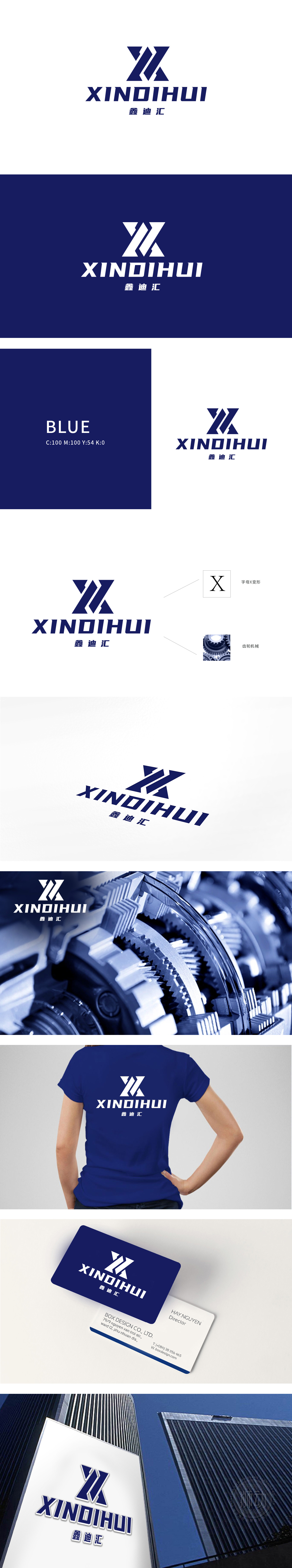
狮动设计以品牌名称首字母“X”为原型,通过硬朗的直线切割与几何拼接,构建出兼具机械感与力量感的视觉符号:交叉的斜向线条与三角形切面,模拟重工机械中“钢架结构”“承重支架”的力学美感,传递行业属性中“坚固、稳定、精密”的核心价值;整体以字母“X”为骨,以齿轮机械为魂,用金属切割般的线条,在方寸之间炸裂出重工行业的硬核冲击力——这不仅是设计,更是对“力量、精密、工业美学”的视觉宣言。
Lion Design takes the brand name initials "X" as the prototype, and through tough straight line cutting and geometric splicing, it constructs a visual symbol with both mechanical sense and strength sense: intersecting oblique lines and triangular sections, simulating the mechanical aesthetic feeling of "steel frame structure" and "load-bearing bracket" in heavy machinery, and conveying the core values of "firmness, stability and precision" in industry attributes; Taking the letter "X" as the bone, taking gear machinery as the soul, and using metal-cut lines, the hard-core impact of heavy industry is exploded between square inches-this is not only a design.


扫码或拨打添加客服微信


