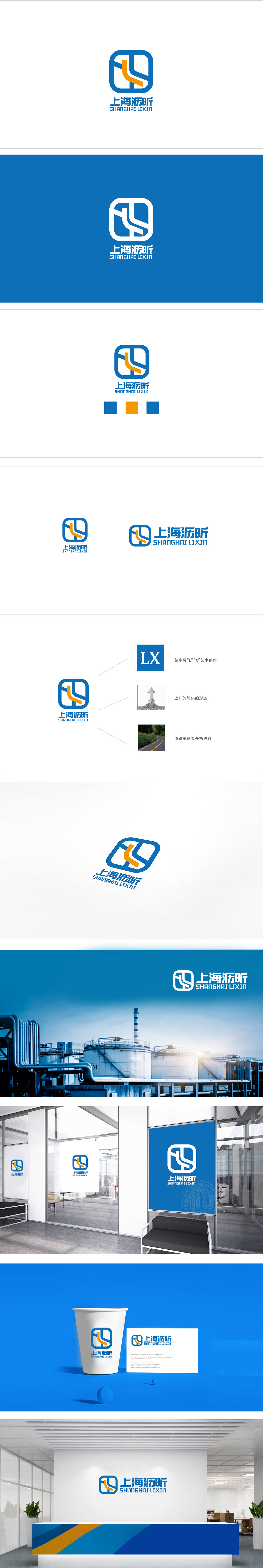
狮动设计以蓝色方形框架为基础,方形象征稳定、可靠,契合化工行业对“安全”“务实”的核心需求。框架内部的橙色曲线+蓝色线条组合,是设计的点睛之笔:橙色曲线形如管道,又似流动的介质,直接关联化工行业“物料传输”“生产流程”的核心场景;蓝色:化工行业的“安全色”,代表科技、专业、冷静,传递企业对生产安全的重视;整体通过“形状(稳重)+ 元素(管道/流动)+ 色彩(安全/活力)”的三重组合,精准传递了化工企业“安全可靠、专业创新”的核心形象。
Lion design is based on the blue square frame, and the square symbol is stable and reliable, which meets the core demand of chemical industry for "safety" and "pragmatism". The combination of orange curve and blue line inside the frame is the crowning touch of the design: the orange curve is like a pipe and a flowing medium, which is directly related to the core scene of "material transmission" and "production process" in the chemical industry; Blue: the "safety color" of the chemical industry, representing science and technology.
 <
<


扫码或拨打添加客服微信


