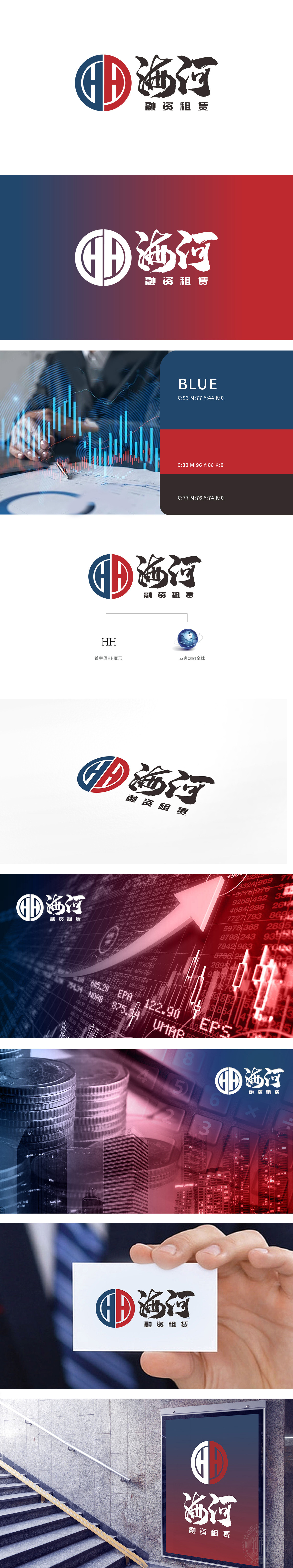
狮动设计以“海河”首字母“HH”为核心创意,通过左右对称的线条构建环形结构:蓝色左侧“H”:竖线与半圆环结合,象征稳定、专业的金融基石,蓝色在金融领域常关联信任、安全与合规;红色右侧“H”:线条更具张力,红色传递活力与成长,暗示融资租赁业务的动态发展与资金流动属性。环形整体:双“H”相互交织形成闭环,既代表“合作”,也隐喻资金的循环流动,环形轮廓则强化“圆满、可靠”的品牌联想,契合金融机构对风险控制与履约能力的强调。通过“HH环形(资金循环+品牌基因)+ 蓝红配色(稳定+增长)+ 书法与地球(本土+全球)”的三重组合,精准传递了“海河融资租赁”作为金融机构的核心价值:品牌“专业严谨+高效灵活”的业务特质。
Lion Design takes the initial "HH" of Haihe River as the core idea, and constructs a ring structure through symmetrical lines: the blue left "H": the combination of vertical lines and semi-ring symbolizes a stable and professional financial cornerstone, and blue is often associated with trust, safety and compliance in the financial field; "H" on the right side of the red color: the lines are more tense, and the red color conveys vitality and growth, implying the dynamic development of financial leasing business and the property of capital flow. Circular whole: Double "H" interweaves with each other to form a closed loop, which not only represents "cooperation" but also symbolizes the circular flow of funds.


扫码或拨打添加客服微信


