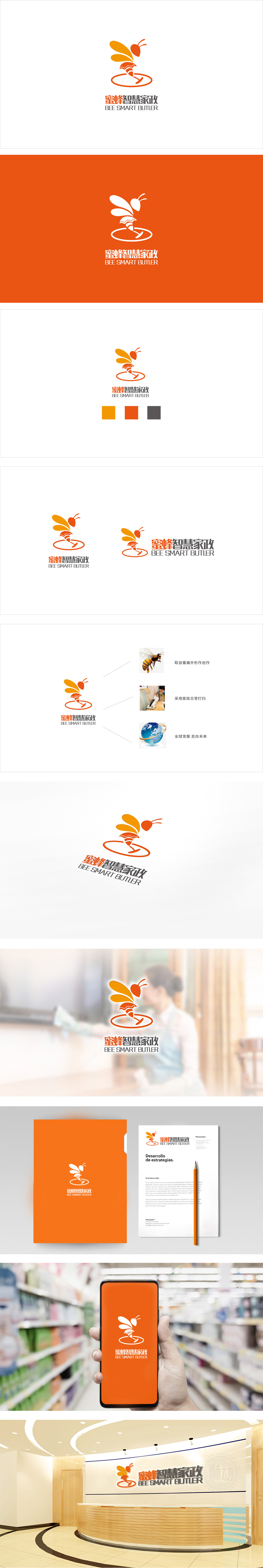
狮动设计以橙色、黄色为主色调,搭配红色点缀,视觉上活泼且温暖,符合家政服务的亲和力属性。核心是一只抽象化的蜜蜂形象——头部为红色圆角三角形,触角向上扬起;翅膀以橙黄色渐变的流线型线条呈现,富有动感;腹部融入“蜂巢纹理”,既呼应蜜蜂的生物特征,也象征“家”的温馨与结构感;蜜蜂下方有一个圆形底座,内嵌工具图案,强化家政服务属性。取蜜蜂“勤劳、高效、精准”的特质,暗喻家政服务的专业与细致。通过自然意象、行业属性与未来愿景的融合,成功塑造了“蜜蜂智慧家政”专业、温暖且具成长性的品牌形象 。
Lion design is mainly based on orange and yellow, with red embellishment, which is visually lively and warm, in line with the affinity attribute of domestic service. The core is an abstract image of a bee-the head is a red rounded triangle, and the tentacles are raised upwards; The wings are presented in streamlined lines with orange-yellow gradient, which is full of movement; The "honeycomb texture" is integrated into the abdomen, which not only echoes the biological characteristics of bees, but also symbolizes the warmth and structure of "home"; There is a circular base under the bee, with embedded tool patterns, which strengthen the attribute of domestic service.


扫码或拨打添加客服微信


