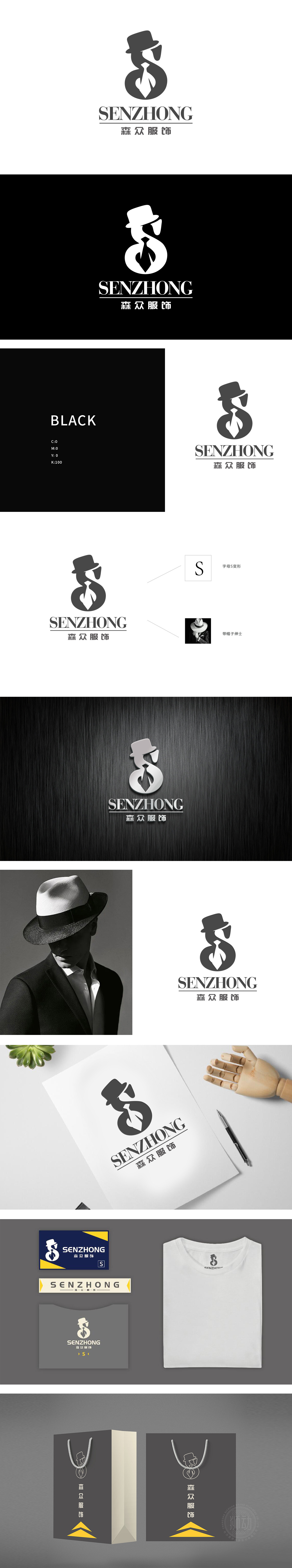
狮动设计以品牌名称首字母“S”为视觉核心,通过流畅的曲线勾勒出“戴帽绅士”的侧身剪影:上部圆弧化作经典礼帽轮廓,中部收窄处自然衔接“领带”与“肩部线条”,下部饱满的环形封闭形成整体沉稳的视觉重心,既保留字母识别度,又赋予图形故事性。线条语言:S形曲线象征优雅、包容,贴合服饰行业对“剪裁流畅”“版型舒适”的产品属性联想,同时环形结构传递品牌“圆满、专业”的信任感。整体通过“字母符号+身份符号+行业符号”的三重融合,既实现了品牌名称的直观识别,又精准传递了“高品质、有格调”的核心价值。
Liondesign takes the initial letter "S" of the brand name as the visual core, and outlines the silhouette of the gentleman in a hat through a smooth curve: the upper arc turns into the outline of a classic hat, the middle narrowed part naturally connects the "tie" with the "shoulder line", and the full circular closure at the lower part forms the overall calm visual center of gravity, which not only retains the letter recognition, but also endows the graphic story. Line language: the S-shaped curve symbolizes elegance and tolerance, which fits the product attribute association of "smooth tailoring" and "comfortable version" in the clothing industry, and at the same time, the circular structure conveys the trust of the brand "completeness and professionalism".


扫码或拨打添加客服微信


