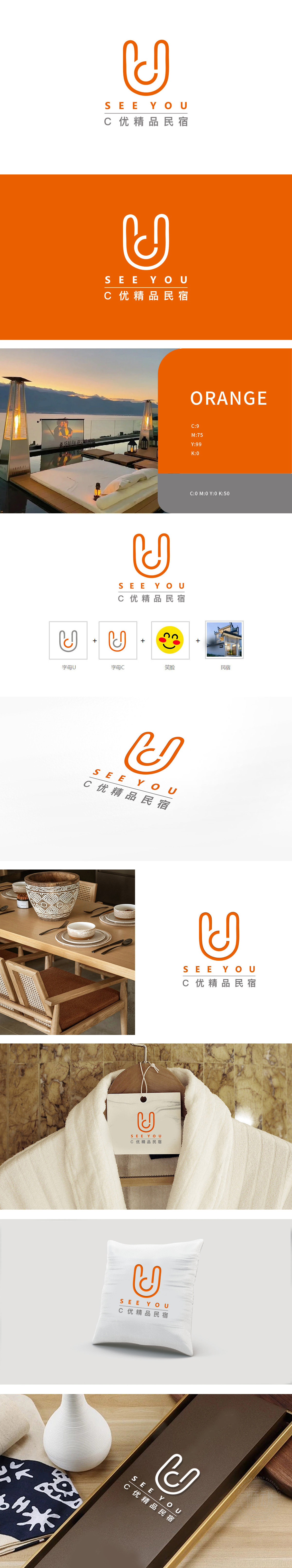
狮动团队以双“U”嵌套为核心创意,象征连接与温馨,橙色主体搭配灰白文字,凸显现代简约风格。设计中巧妙融合品牌理念,“SEE YOU”字样增添亲切感,整体视觉极具辨识度。客户对设计方案高度赞赏,直言狮动的专业与创新为其品牌注入活力,新客户亦纷纷为狮动的设计能力所折服。
Lion Dance Team takes the double "U" nesting as the core idea, symbolizing connection and warmth, and the orange main body is matched with gray and white characters, highlighting the modern minimalist style. The brand concept is skillfully integrated in the design, and the word "SEE YOU" adds intimacy, and the overall vision is highly recognizable. Customers highly appreciate the design scheme, bluntly speaking, the professionalism and innovation of Lion Motion have injected vitality into its brand, and new customers have also been impressed by the design ability of Lion Motion.


扫码或拨打添加客服微信


