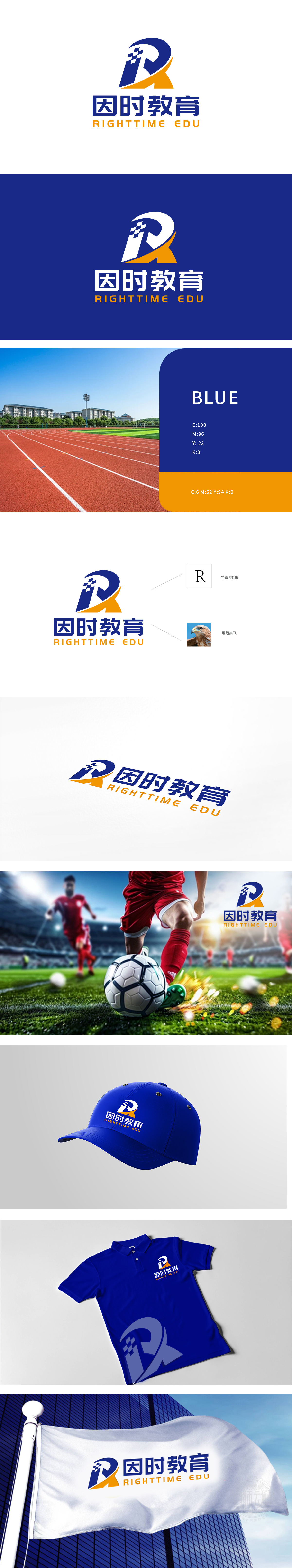
狮动设计采用流体线条与几何切割结合,左侧蓝色块呈现方形网格纹理,既象征教育领域的规则性、系统性,又暗合体育竞技中的策略性与目标导向。黄色弧线向右上方延伸,打破字母的静态结构,形成向上的动态趋势,传递教育带来的“成长力”与体育精神中的“突破力”,整体设计通过蓝色网格精密的知识矩阵,黄色弧线似挣脱束缚的闪电,而那隐于字母“R”中的鹰首,正以睥睨之势宣告:这不是平庸的教育品牌,而是一场关于“成长加速度”的视觉革命。
Lion design combines fluid lines with geometric cutting, and the blue block on the left presents a square grid texture, which not only symbolizes the regularity and systematicness in the field of education, but also coincides with the strategy and goal orientation in sports competition. The yellow arc extends to the upper right, breaking the static structure of letters, forming an upward dynamic trend, and transmitting the "growth force" brought by education and the "breakthrough force" in sports spirit. The overall design is like lightning that breaks free from bondage through the precise knowledge matrix of blue grid.


扫码或拨打添加客服微信


