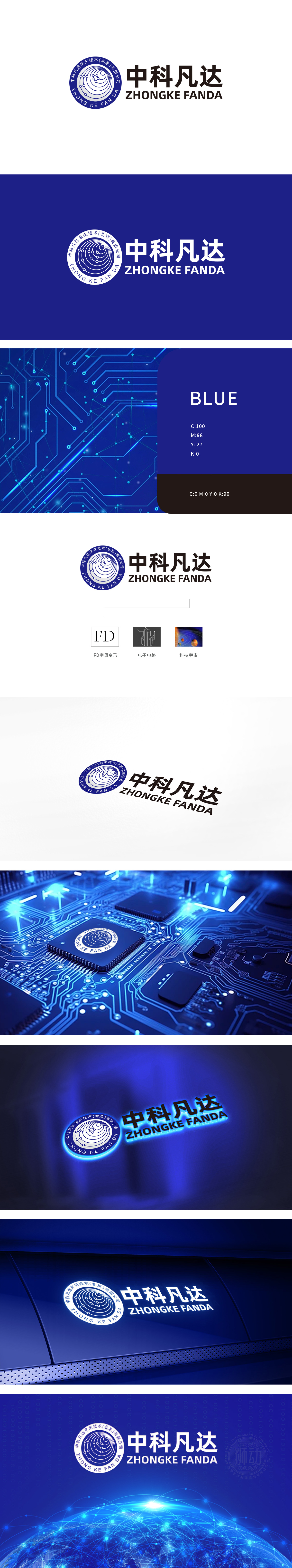
狮动设计以蓝色为主色调,内圈由多个同心圆轨道环绕,轨道上点缀“节点”与“连接线”,形似行星运行轨迹或粒子运动路径,轨道图形直接关联“科技宇宙”主题,蓝色象征理性、探索与无限可能,符合IT行业对“前沿性”“未知探索”的价值表达;动态感与包容性:同心圆结构既体现“循环发展”“生态闭环”的科技理念,也暗喻企业业务的全球化视野,通过“微观技术(电子电路)—中观品牌(FD字母)—宏观愿景(科技宇宙)”的三层符号体系既精准传递了IT行业的“技术属性”,又以“宇宙探索”的意象赋予品牌“前瞻性”与“想象空间”。
Lion design is dominated by blue, and the inner ring is surrounded by multiple concentric orbits, which are dotted with "nodes" and "connecting lines", which are similar to planetary trajectories or particle motion paths. The orbit graphics are directly related to the theme of "scientific universe", and blue symbolizes rationality, exploration and infinite possibilities, which conforms to the value expression of "frontier" and "unknown exploration" in IT industry. Dynamic and inclusive: the concentric circle structure not only embodies the scientific and technological concept of "circular development" and "ecological closed loop".


扫码或拨打添加客服微信


