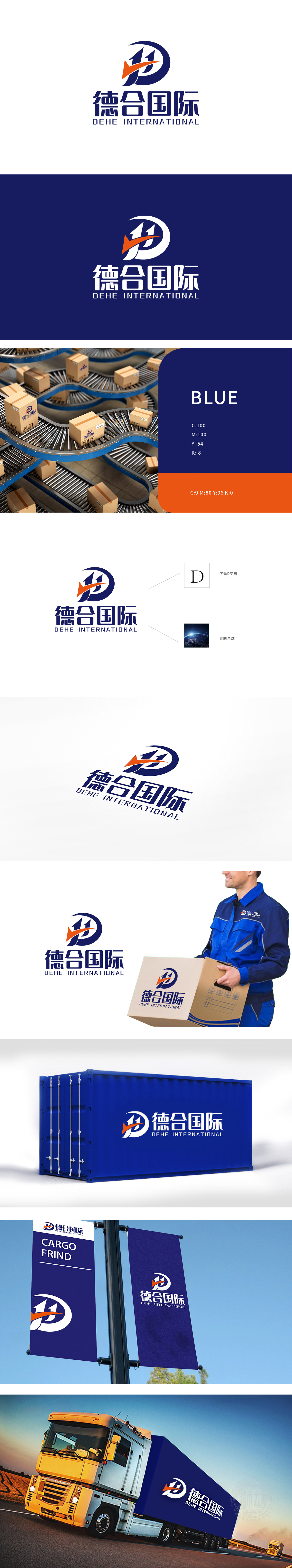
狮动设计线条以首字母“D”为核心设计起点,外侧蓝色环形线条构成“D”的轮廓,传递出物流行业的“连接”与“循环”属性。动态元素融入抽象“11”符号(象征高效、双向流通或“一心一意”的服务理念),箭头呈右向锐角设计,搭配橙色的视觉冲击感,强化了“速度”“前进”“高效运输”的行业特质,与物流行业对时效性的核心需求高度契合。LOGO设计巧妙平衡了品牌个性与行业属性,通过极简的图形语言传递出德合国际“专业可靠、高效连接、全球布局”的物流服务定位。
Lion design line takes the initial "D" as the core design starting point, and the outer blue circular line forms the outline of "D", which conveys the "connection" and "circulation" attributes of logistics industry. Dynamic elements are integrated into the abstract "11" symbol (symbolizing the service concept of high efficiency, two-way circulation or "single-minded"), and the arrow is designed with an acute right angle, which strengthens the industry characteristics of "speed", "progress" and "efficient transportation" and is highly consistent with the core demand of the logistics industry for timeliness. LOGO design skillfully balances brand personality and industry attributes.


扫码或拨打添加客服微信


