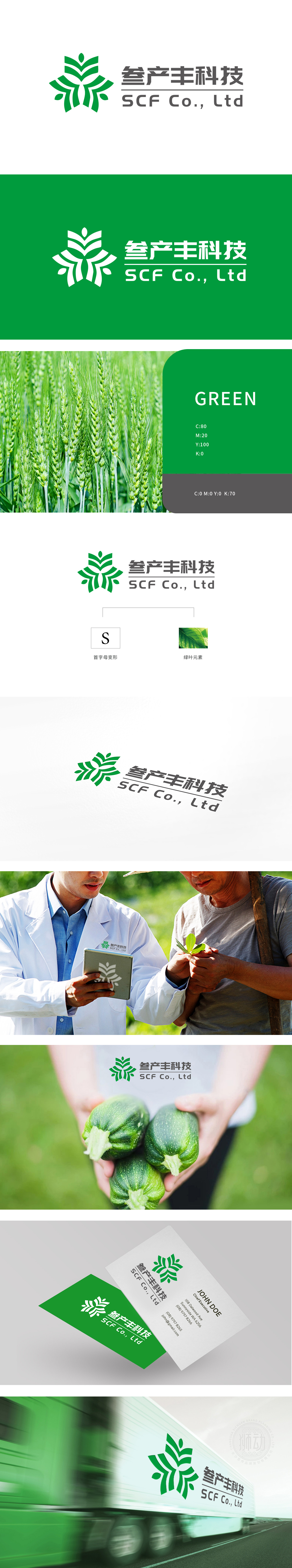
狮动设计线条以首字母“S”为创意基础,通过流畅的曲线变形,融合了植物生长的动态感和自然循环的意象。线条从中心向外发散,形似作物从根部向上生长、向四周延展,暗合农牧渔业“扎根土地、蓬勃生长”的核心属性,传递出“丰产、丰收”的行业期待,绿色作为农牧渔业的经典代表色(象征生机、健康、环保),强化了品牌与农业种植、生态产业的直接关联,传递出“绿色农业、科技赋能”的定位。整体设计以首字母为基因、以生长为动力、以绿色为铠甲,让“农业”不再是静态的“自然景观”,而是动态的“生产力图腾”。
Lion design lines are based on the initial letter "S", and through smooth curve deformation, they combine the dynamic sense of plant growth and the image of natural cycle. The lines diverge outward from the center, like crops growing upward from the roots and extending around, which coincides with the core attributes of agriculture, animal husbandry and fishery, and conveys the industry expectation of "high yield and bumper harvest". As a classic representative color of agriculture, animal husbandry and fishery (symbolizing vitality, health and environmental protection), green strengthens the direct relationship between brands and agricultural planting and ecological industries, and conveys "green agriculture and technological empowerment".


扫码或拨打添加客服微信


