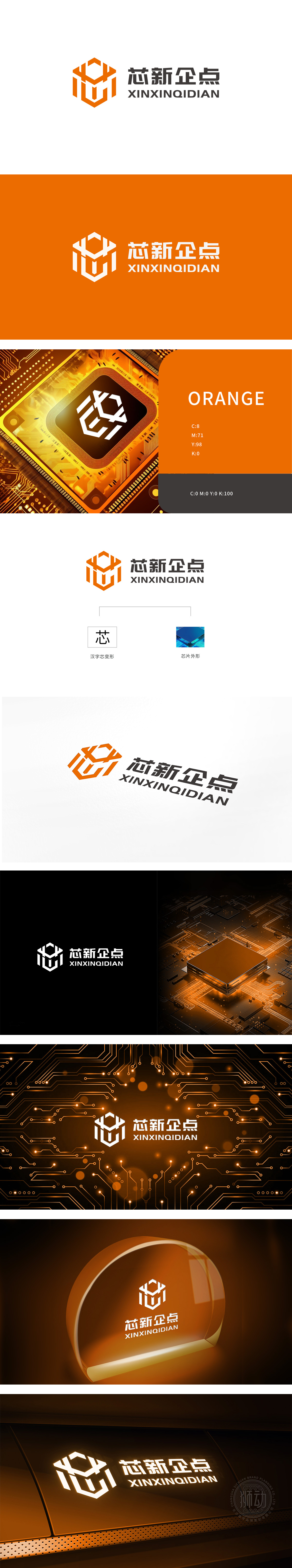
狮动设计以橙色六边形为基底框架(呼应芯片晶圆的六边形结构),内部通过直线与折线勾勒出汉字“芯”的抽象形态,线条刚硬利落,兼具科技感与品牌辨识度。色彩寓意:橙色象征创新活力与前沿科技,传递“芯新企点”在芯片领域的进取精神;六边形框架则强化了“芯片”的行业属性,呼应右侧“芯片外形”的设计备注,实现图形与行业属性的直接关联。图形以“芯”为核心,既点明“芯片”的行业属性,又谐音“新”,暗合“创新起点”的品牌定位(“企点”可解读为“企业新起点”),实现“名称-行业-愿景”的三重语义传达。“传统与现代结合”的巧思,既懂行业属性,又能通过创意实现品牌价值的可视化表达。
Lion design is based on orange hexagon (echoing the hexagonal structure of chip wafer), and the abstract form of Chinese character "core" is outlined by straight lines and broken lines. The lines are rigid and neat, and it has both scientific and technological sense and brand recognition. Color implication: orange symbolizes innovation vitality and cutting-edge technology, and conveys the enterprising spirit of "core new enterprise" in the chip field; The hexagonal frame strengthens the industry attribute of "chip", echoes the design remarks of "chip shape" on the right, and realizes the direct correlation between graphics and industry attribute. With "core" as the core, graphics not only point out the industry attribute of "chip", but also homophonic "new".


扫码或拨打添加客服微信


