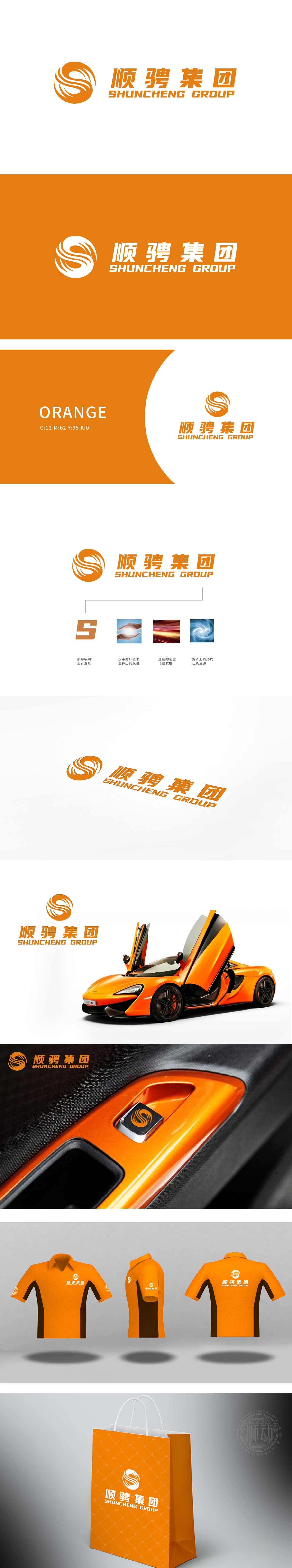
狮动设计以字母“S”为核心设计原点,通过旋转、流线型的橙色螺旋形态,形成强烈的动态视觉效果:螺旋线条的环绕与“速度的造型,与汽车行业追求的“动力、加速、高效”属性高度契合。流畅的曲线类似汽车行驶中气流划过车身的轨迹,间接传递出与“移动”“驾驶”相关的行业联想。整体通过抽象符号+理念赋能的方式,以抽象视觉语言传递出“活力、高效、可靠”的品牌气质。
Lion Design takes the letter "S" as the core design origin, and forms a strong dynamic visual effect through the rotating and streamlined orange spiral shape: the spiral line surrounding and the "speed modeling" are highly consistent with the attributes of "power, acceleration and efficiency" pursued by the automobile industry. The smooth curve is similar to the trajectory of airflow across the car body while driving, which indirectly conveys the industry association related to "moving" and "driving".


扫码或拨打添加客服微信


