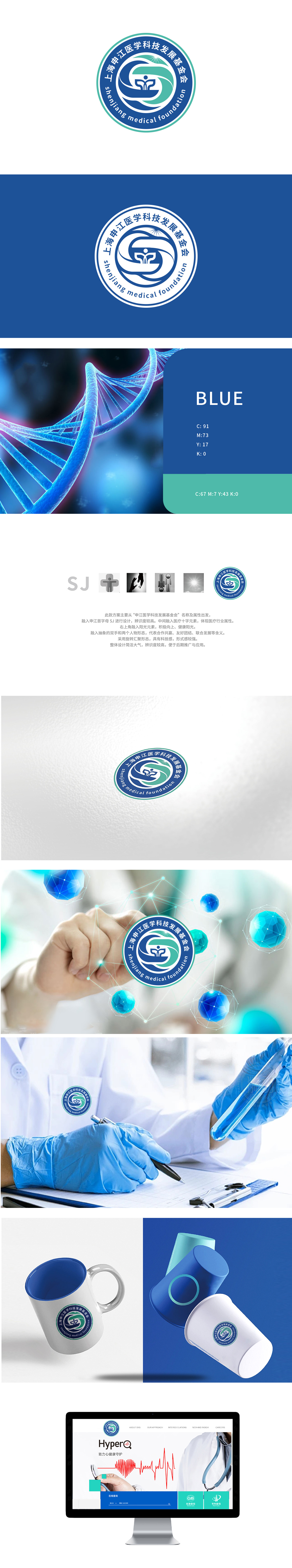
狮动设计以首字母“SJ”作为视觉起点,用简洁的无衬线字体呈现,字体形态方中带圆,既保留了科技感的利落,又不失医疗行业的温和。更巧妙的是,医疗十字元素被自然嵌入“SJ”右侧的图标中侧,十字符号作为医疗行业的“视觉语言”,让受众瞬间联想到“医学”属性,这种“名称+行业”的双符号组合,像一把“钥匙”,直接打开了品牌与受众之间的认知通道,辨识度极高。用最简洁的语言,说最有力的故事,这正是设计的高明之处。让视觉成为品牌的“代言人”。
Lion design takes the initial letter "SJ" as the visual starting point, and presents it in a simple sans serif font with a circle in the square, which not only retains the neat sense of science and technology, but also does not lose the gentleness of the medical industry. More subtly, the medical cross element is naturally embedded in the middle side of the icon on the right side of "SJ". As the "visual language" of the medical industry, the cross symbol instantly reminds the audience of the "medical" attribute. This double symbol combination of "name+industry" is like a "key".


扫码或拨打添加客服微信


