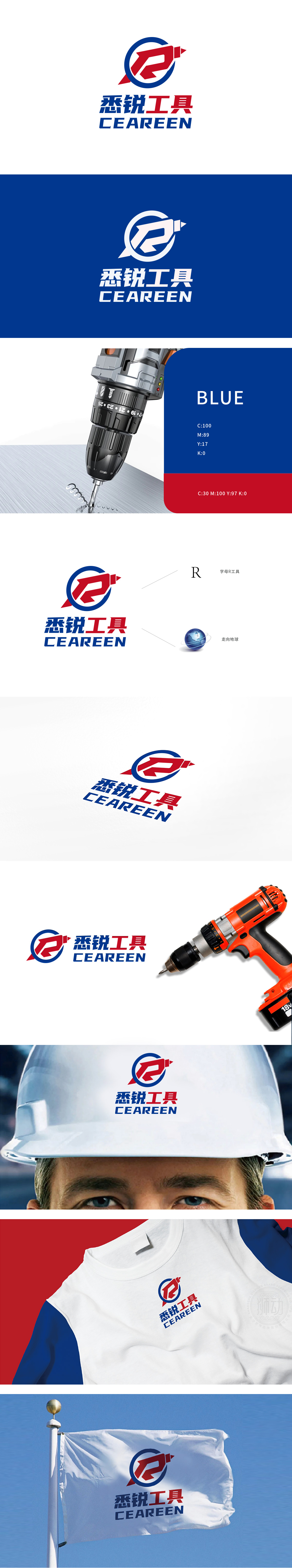
狮动设计将品牌字母“R”抽象为五金工具的典型形态——红色线条的走势像一把开口扳手,又似一把螺丝刀。这种“字母=工具”的符号化处理,既保留了品牌的字母识别性,又通过极简线条传递了工具的功能性本质,红色是工具行业的“专属色”——它代表力量感、警示,同时在视觉上极具冲击力,符合五金产品“直观、实用”的用户认知。用“工具的语言”讲品牌的故事:同时传递了品牌的战略价值专业、全球化。
Lion design abstracts the brand letter "R" as a typical form of hardware tools-the trend of red lines is like an open-ended wrench and a screwdriver. This symbolization of "letter = tool" not only retains the letter recognition of the brand, but also conveys the functional essence of the tool through minimalist lines. Red is the "exclusive color" of the tool industry-it represents the sense of strength and warning, and at the same time has great visual impact, which conforms to the user's cognition of "intuitive and practical" hardware products. Tell the story of the brand with "tool language": at the same time, convey the strategic value of the brand, professionalism and globalization.


扫码或拨打添加客服微信


