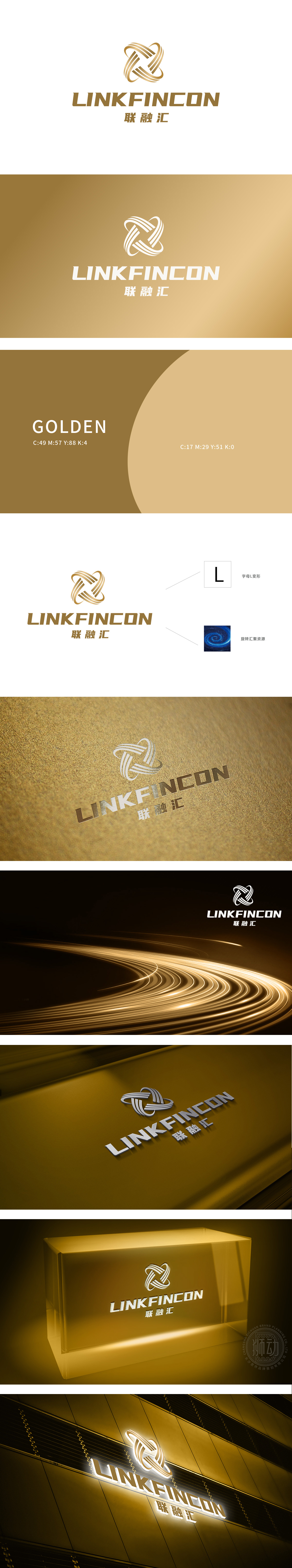
狮动设计以线条相互交织,形成一个动态的结构,象征着资源的汇聚和信息的流通,这与互联网科技中的数据连接和资源整合理念紧密相关。字母“L”变形:标识中的设计元素可以视为字母“L”的变形,进一步强化了品牌名称中的“LINK”(连接)概念。旋转汇聚资源:标识的设计风格暗示了旋转和汇聚的动作,理解为数据、资源或信息在互联网科技中的流动和集中。从互联网科技的“连接性”“整合性”“生态性”“动态性”出发,用**“字母变形+螺旋纹”的组合,将抽象的品牌战略转化为可感知的科技视觉语言。
Lion design interweaves lines to form a dynamic structure, which symbolizes the convergence of resources and the circulation of information, which is closely related to the concept of data connection and resource integration in Internet technology. Distortion of the letter "L": The design elements in the logo can be regarded as the deformation of the letter "L", which further strengthens the concept of "LINK" in the brand name. Rotating and gathering resources: the design style of the logo implies the action of rotation and gathering, which is understood as the flow and concentration of data, resources or information in Internet technology.


扫码或拨打添加客服微信


