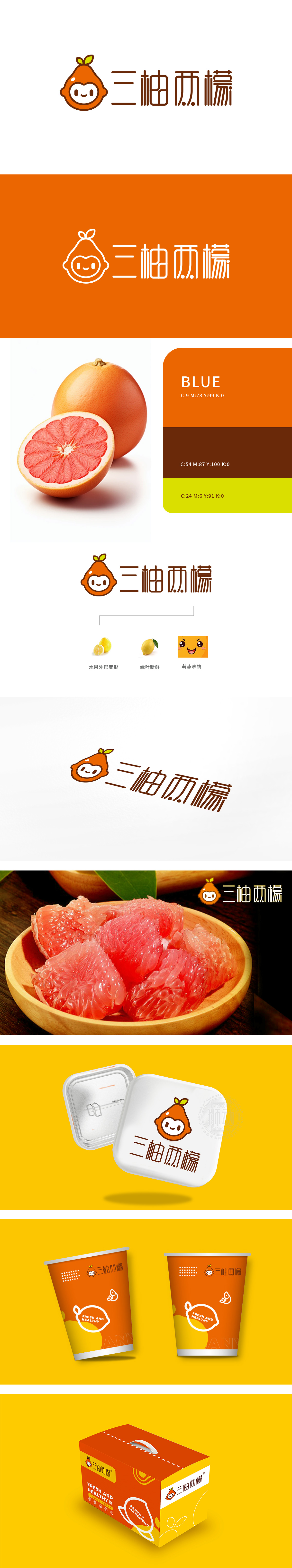
狮动设计以柚子/柠檬的「橙色果皮」为主体,保留了水果顶端的「绿叶蒂」(生鲜的核心符号),但将其拟人化为「圆眼睛+微笑」的卡通形象——既强化了「三柚两檬」的「水果品牌」属性,又通过「萌态表情」打破了传统生鲜品牌的「生硬感」,让消费者对品牌产生「亲切、可爱」的情感连接,整体用「拟人化」「符号化」「萌态化」的图形语言,把「三柚两檬」这个品牌变成了「能说话的水果」,传递了生鲜农产品「新鲜、亲切、天然」的核心价值。
Lion design takes the orange peel of grapefruit/lemon as the main body, and retains the green leaf pedicle at the top of the fruit (the core symbol of fresh food), but personifies it as a cartoon image of "round eyes+smile", which not only strengthens the "fruit brand" attribute of "three pomelo and two lemons", but also breaks the "stiff feeling" of traditional fresh food brands through "cute expression". With the graphic language of personification, symbolization and sprouting, the brand of "Three Pomelos and Two Lemons" has been turned into a "talking fruit", conveying the core values of fresh agricultural products as "fresh, friendly and natural".


扫码或拨打添加客服微信


