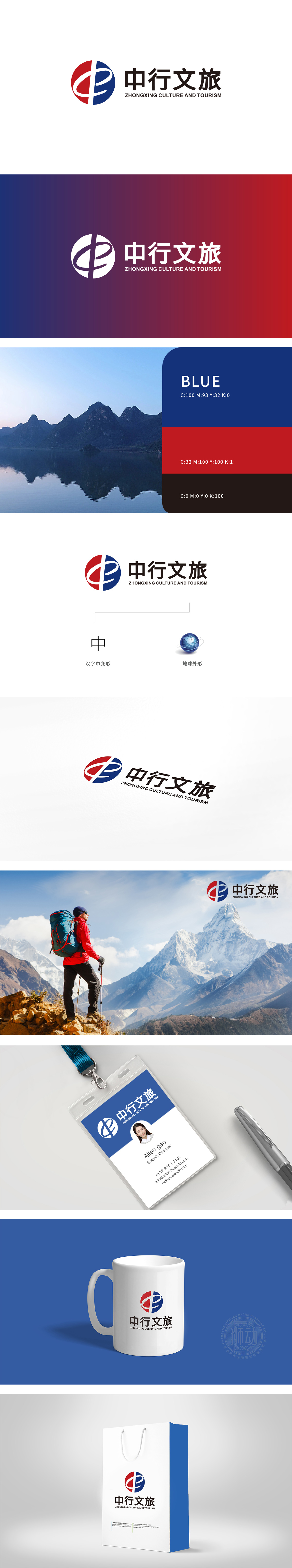
狮动设计采用红色区域的曲线像「山」(自然景观的代表),蓝色区域的曲线像「水」(流动的旅行、文化的传播),两者组合成「山水相依」的意象——这是中国文旅最核心的IP;同时,曲线也隐含「中行」,实现了「企业名称」与「行业属性」的巧妙融合。把LOGO的视觉元素「翻译」成了用户能代入自己经历的感受,把「中行文旅」的品牌价值,藏进了每一个人都懂的「旅行记忆」里。
Lion designs the curve of the red area like "mountain" (the representative of natural landscape) and the curve of the blue area like "water" (flowing travel and cultural spread), which are combined into the image of "mountains and rivers are interdependent"-this is the core IP of China's cultural tourism; At the same time, the curve also implies "Bank of China", which realizes the ingenious integration of "enterprise name" and "industry attribute". Translate the visual elements of the LOGO into feelings that users can substitute for their own experiences, and hide the brand value of "Chinese travel" into the "travel memory" that everyone understands.


扫码或拨打添加客服微信


