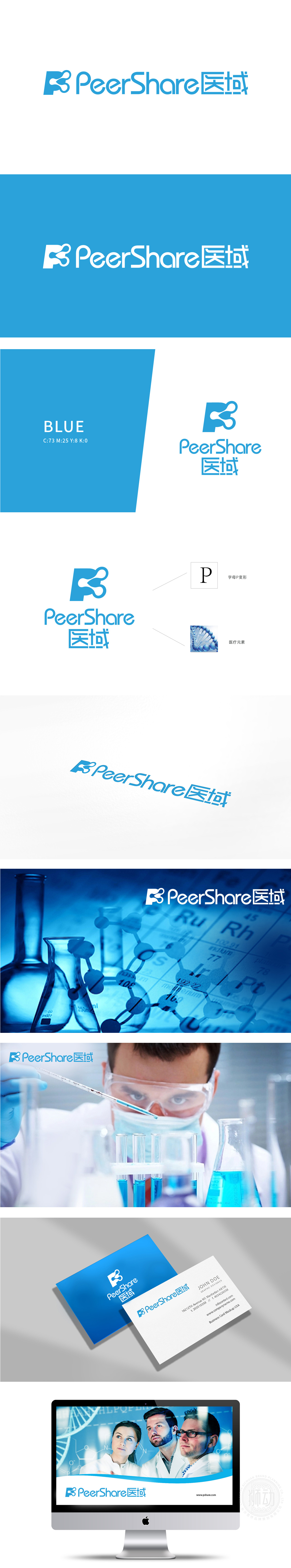
狮动设计将「P」内部的「分子结构」——曲线+圆点的组合,像DNA双螺旋的简化版,又像细胞分裂的瞬间,直接关联「医疗、生物科技、生命科学」的行业内核。这种「形中有形」的设计,让懂行的人能读出「生物医疗」的细节,普通用户也能感受到「科技感」,兼顾了行业深度与大众认知,主色选了低饱和度的蓝,这是医疗行业的「信任色」——它让人联想到医院的冷静、科技的可靠,也符合大众对「医疗服务」的核心需求:放心、专业。最终的logo,既能让用户「一眼认出是医疗品牌」,又能「读懂它的核心价值」把品牌基因、行业属性与核心价值,用「一眼就能懂」的视觉语言,揉得既精准又有温度。
Lion Design directly relates the "molecular structure" inside "P"-the combination of curve and dot, like the simplified version of DNA double helix and the moment of cell division, to the industry core of "medical treatment, biotechnology and life science". This "tangible" design allows knowledgeable people to read the details of biomedical care, and ordinary users can also feel the sense of technology, taking into account the depth of the industry and the public's cognition. The main color is blue with low saturation, which is the "trust color" of the medical industry-it reminds people of the calmness of hospitals and the reliability of technology.


扫码或拨打添加客服微信


