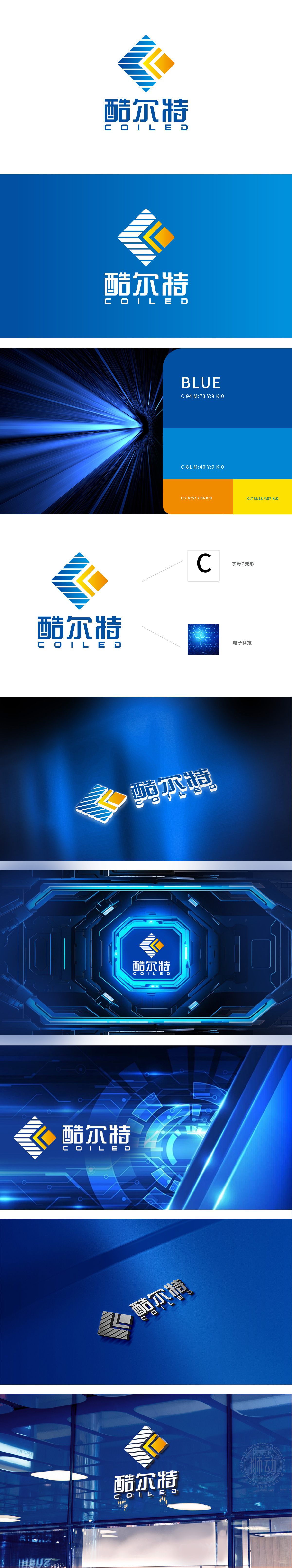
狮动设计以菱形框架为核心,蓝白相间的斜条纹如芯片中的精密电路般排列,既传递出科技领域的严谨感,又暗含了芯片结构的线性美学;右侧黄色+橙色的几何块像一块发光的“图形处理单元”,为整体注入了活力与创新气息,仿佛在暗示图形分析领域的视觉爆发力。好的设计不仅要好看,更要“懂”技术。
Lion design takes the diamond frame as the core, and the blue and white diagonal stripes are arranged like precision circuits in the chip, which not only conveys the sense of rigor in the field of science and technology, but also implies the linear aesthetics of the chip structure. The yellow+orange geometric block on the right is like a luminous "graphics processing unit", which injects vitality and innovation into the whole, as if implying the visual explosive force in the field of graphics analysis. Good design should not only look good, but also "understand" the technology.


扫码或拨打添加客服微信


