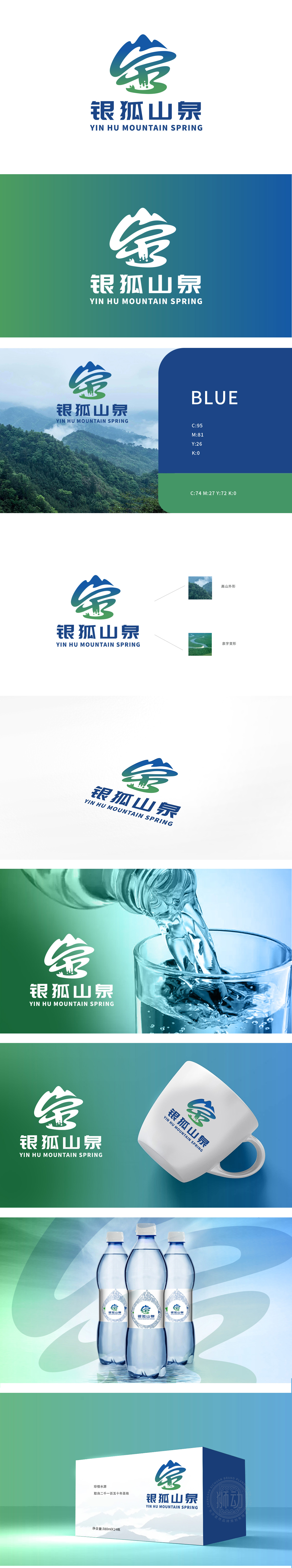
狮动设计由“高山”与“泉字变形”两大元素叠加而成,二者共同构建了“高山孕清泉”的经典场景,直接戳中矿泉水消费者对“水源地”“天然性”的核心需求:用极简的曲线勾勒出高山的轮廓,蓝色渐变模拟了天空与山体的层次感,瞬间关联“矿泉水源自高山”的认知,泉字变形:中间的“泉”字是整个设计的“灵魂”!设计师用流畅的曲线将“泉”字的“白”与“水”部抽象为“流动的泉水”,笔画的走势模拟了泉水从山间倾泻而下的动态——仿佛能让人听见泉水叮咚的声音,看见泉水清澈的样子。这种“文字图形化”的处理,既保留了汉字的文化底蕴,又用现代语言诠释了“泉”的本质,堪称“形神兼备”。
Lion design is formed by the superposition of two elements, namely "mountain" and "spring deformation". Together, they construct the classic scene of "mountain pregnant with clear springs", which directly pokes the core demand of mineral water consumers for "water source" and "naturalness": the outline of the mountain is outlined with minimalist curves, the blue gradient simulates the layering between the sky and the mountain, and instantly relates to the cognition that "mineral water originates from the mountain", and the spring deformation: the middle. Designers abstract the "white" and "water" parts of the word "spring" as "flowing spring water" with smooth curves, and the trend of strokes simulates the dynamic of spring water pouring down .


扫码或拨打添加客服微信


