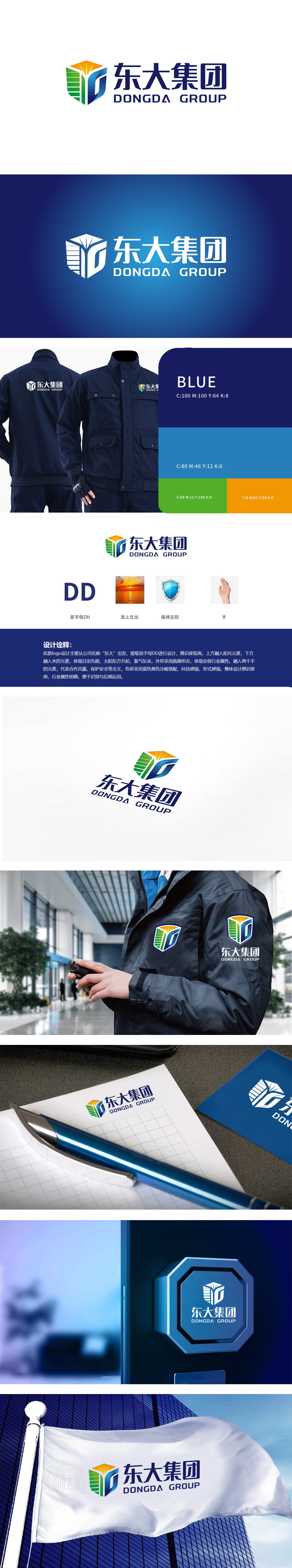
狮动设计由绿色竖条象征企业发展的稳健与生机;橙色部分模拟太阳升起的形态,传递企业的活力与希望;蓝色弧形则巧妙勾勒出字母“D”(首字母),直接关联企业名称“东大”,强化品牌记忆点。蓝色盾牌+金属质感的设计,直接关联“保安/安防”业务(如守护、安全),明确传递企业的核心服务领域。盾牌的“坚硬感”与“防护属性”,瞬间建立起“值得信赖”的品牌联想。巧妙之处在于“元素联动”与“属性强化”:形成“值得托付”的品牌信任。
Lion design symbolizes the stability and vitality of enterprise development by green vertical bars; The orange part simulates the rising form of the sun and conveys the vitality and hope of the enterprise; The blue arc cleverly outlines the letter "D" (the first letter), which is directly related to the enterprise name "Dongda" and strengthens the brand memory. The design of blue shield and metal texture is directly related to the "security/security" business (such as guarding and safety), and clearly conveys the core service areas of the enterprise.


扫码或拨打添加客服微信


