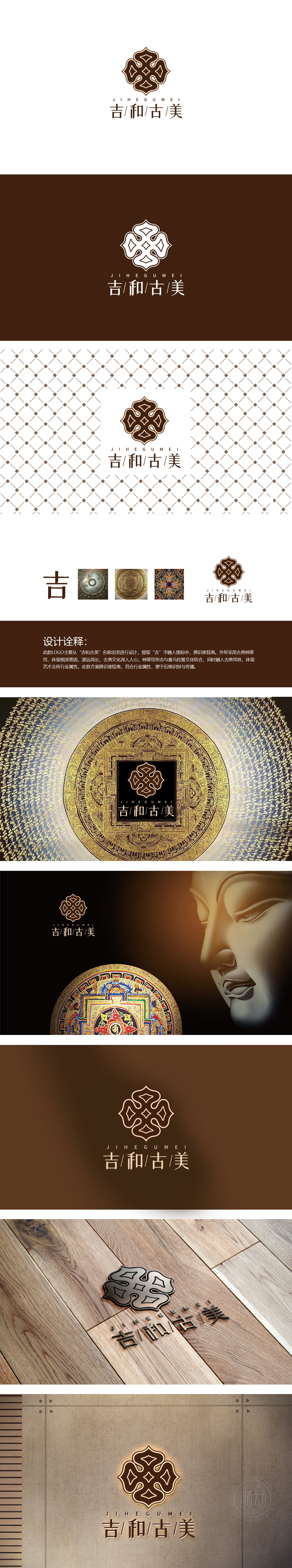
狮动设计用传统元素转化成「现代翻译」形成了一条「视觉逻辑链」,一步步把「吉、和、古、美」的品牌关键词「画」了出来:「古」= 信任:青铜器皿、金色纹饰这些「老物件」的质感,会让人本能地联想到「古方」「传承」「经过时间验证」。「美」= 品质:彩色曼陀罗的撞色、LOGO的简洁设计,都在传递「我们的产品不仅有效,还很有质感」。保健品不再是「功能性产品」,而是「能提升生活品质的伴手礼」,符合当代消费者「既要健康,也要审美」的需求。「吉」= 情绪:开头的「吉」字、整体的吉祥图案,都在传递「祝福」的情绪。把传统元素做了「活的转化」,既保留了古色古香的质感,又精准贴合了保健品品牌的核心诉求,每一个元素都像「说话」一样,在传递品牌的故事。
Lion design forms a visual logic chain from the modern translation of traditional elements, and gradually brings out the brand key words of "auspicious, harmonious, ancient and beautiful": "antique" = trust: the texture of "old objects" such as bronze vessels and gold patterns will make people instinctively associate with "antique", "inheritance" and "time-tested" "Beauty" = quality: the contrast of color Datura and the simple design of LOGO all convey that "our products are not only effective, but also very textured". Health care products are no longer "functional products", but "gifts that can improve the quality of life", which meet the needs of contemporary consumers for "both health and aesthetics".


扫码或拨打添加客服微信


