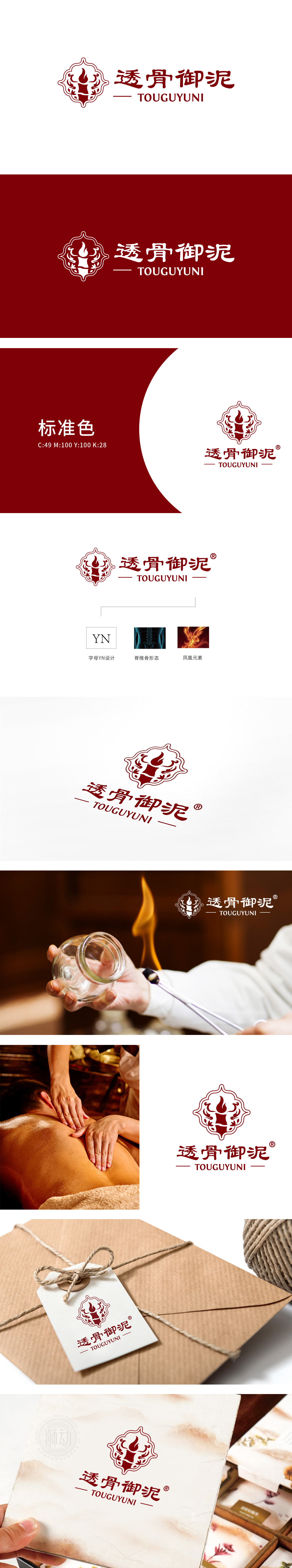
狮动设计融入火焰/烛光”形态,转化为“Y”的抽象——线条轻盈向上,既有“温暖、渗透”的感官暗示,又通过对称的花瓣/云纹装饰,传递出“古典、雅致”的传统调性;中间的“柱状结构”是“N”的变形,与上下的装饰纹组合成类似“鼎”或“烛台”的轮廓,强化“稳固、可靠”的品牌印象;透骨御泥”字体:采用粗笔书法体,笔画浑厚有力,“透”字的笔势有“渗透”的动态感,“御”字的结构有“端庄”的仪式感,既符合“中医养生”的传统调性,又通过书法的“力度”强化“透骨”的功效感。整体对称的布局符合中国传统美学中的“平衡感”,给人“稳重、和谐”的心理感受,完美匹配“御泥”所暗示的“高端、宫廷级品质”。
Lion design is integrated into the form of flame/candlelight, and transformed into the abstraction of "Y"-the lines are light and upward, which not only has the sensory hint of "warmth and infiltration", but also conveys the traditional tonality of "classicality and elegance" through the symmetrical petal/moire decoration; The "columnar structure" in the middle is the deformation of "N", which is combined with the upper and lower decorative patterns to form an outline similar to "Ding" or "Candlestick" to strengthen the brand impression of "stability and reliability"; The font "Tougu Royal Mud": The brush strokes are thick and powerful, the brushwork of Tou has a dynamic sense of penetration, and the structure of Yu has a sense of ceremony.


扫码或拨打添加客服微信


