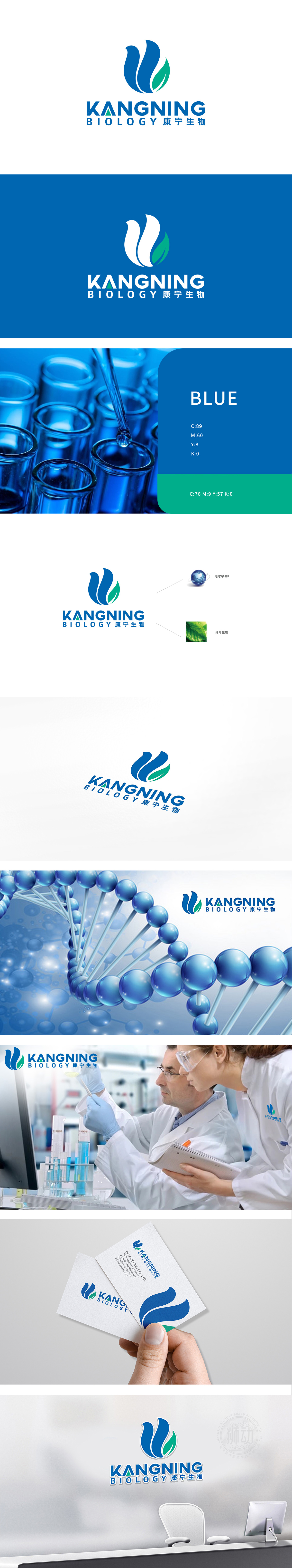
狮动设计采用蓝色曲线化为品牌名称首字母「K」的变形,既保留了字母的辨识度,又通过流畅的弧线打破了生硬感,符合生物科技行业的「温和感」与「未来感」。叶片的轮廓与叶脉纹理直接关联「生物」「生命科学」「健康」的核心赛道。整体胡设计「简洁而不简单」,将「K+地球+绿叶」的融合,暗示了「科技赋能全球生命健康」的品牌使命。
Lion design adopts blue curve as the deformation of the initial letter "K" of the brand name, which not only retains the recognition of letters, but also breaks the sense of rigidity through smooth arc, which conforms to the "gentleness" and "futuristic" of biotechnology industry. The contour of leaves and vein texture are directly related to the core track of "biology", "life science" and "health". The overall design of Hu is "concise but not simple", which combines "K+ Earth+Green Leaves" and implies the brand mission of "Science and Technology Empowering Global Life and Health".


扫码或拨打添加客服微信


