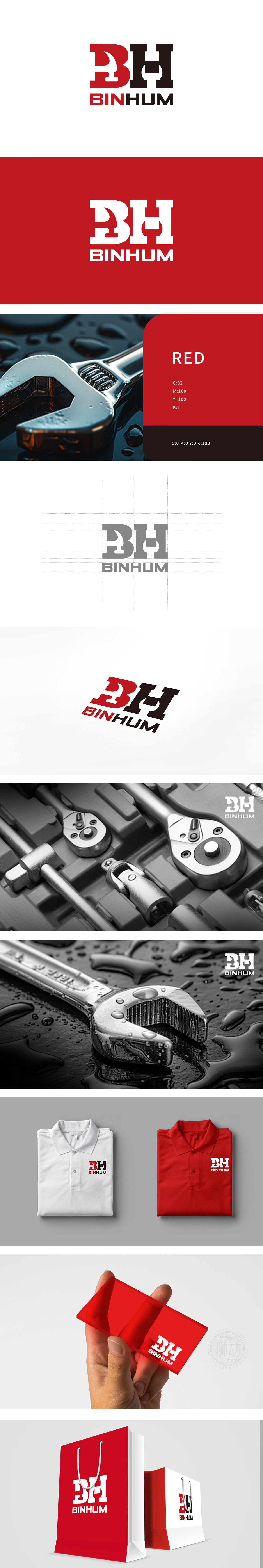
狮动设计以品牌缩写**“BH”为视觉核心,通过字母内部的负形设计,巧妙植入五金行业的典型工具元素,既保留了品牌识别性,又直观传递了行业属性。红色:象征“力量、活力、耐用”,符合五金工具“结实、可靠”的产品属性;整体形态的“极简与平衡”:“BH”字母采用“方块化”设计,通过配色、形态的选择,完美贴合五金行业的“硬朗、专业”调性,让LOGO不仅好看,更“符合品牌定位”。
Lion design takes the brand abbreviation * * "BH" as the visual core, and skillfully implants the typical tool elements in the hardware industry through the negative design inside the letters, which not only retains the brand recognition, but also intuitively conveys the industry attributes. Red: symbolizes "strength, vitality and durability" and conforms to the product attributes of "firmness and reliability" of hardware tools; "Minimalism and balance" of the overall form: the letter "BH" adopts a "block" design. Through the choice of color matching and form, it perfectly fits the "tough and professional" tonality of the hardware industry, making the LOGO not only beautiful, but also "in line with brand positioning".


扫码或拨打添加客服微信


