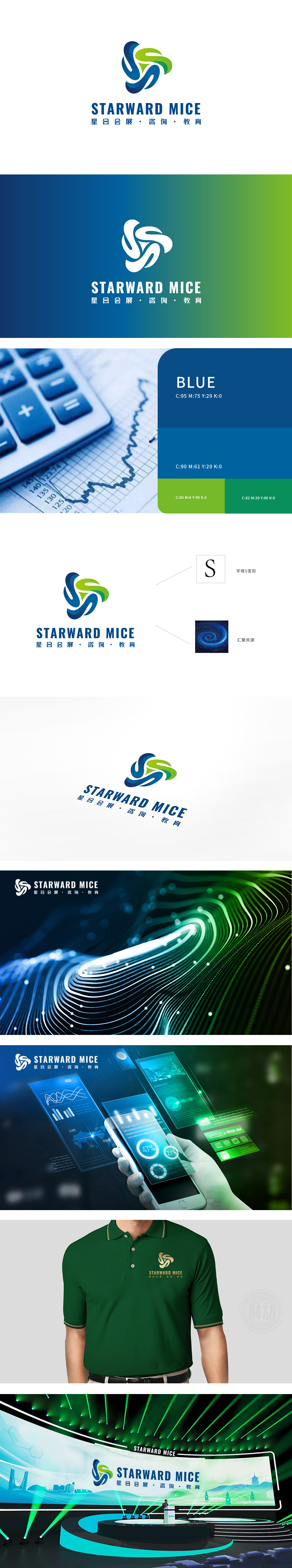
狮动设计用“流动的符号”传递行业本质,logo 的核心图形是两组交织的曲线,通过字母变形+象征符号的组合,精准传递了 MICE 行业的“连接性”与“动态性”:字母“S”的具象化,两者交织成循环结构,象征“信息流动”资源连接。流动感的视觉语言:曲线的“舒展+交织”形态传递出动态、灵活、创新的气质,符合咨询行业“解决问题的灵活性”与教育行业“知识传递的生机”,此设计通过蓝色+绿色的组合,精准平衡了“专业感”与“活力感”。
Lion design uses "flowing symbols" to convey the essence of the industry. The core graphics of logo are two sets of intertwined curves. Through the combination of letter deformation and symbolic symbols, it accurately conveys the "connectivity" and "dynamics" of MICE industry: the letter "S" is materialized, and they are intertwined into a circular structure, symbolizing the "information flow" resource connection. The visual language of fluidity: the "stretching+interweaving" shape of the curve conveys a dynamic, flexible and innovative temperament.


扫码或拨打添加客服微信


