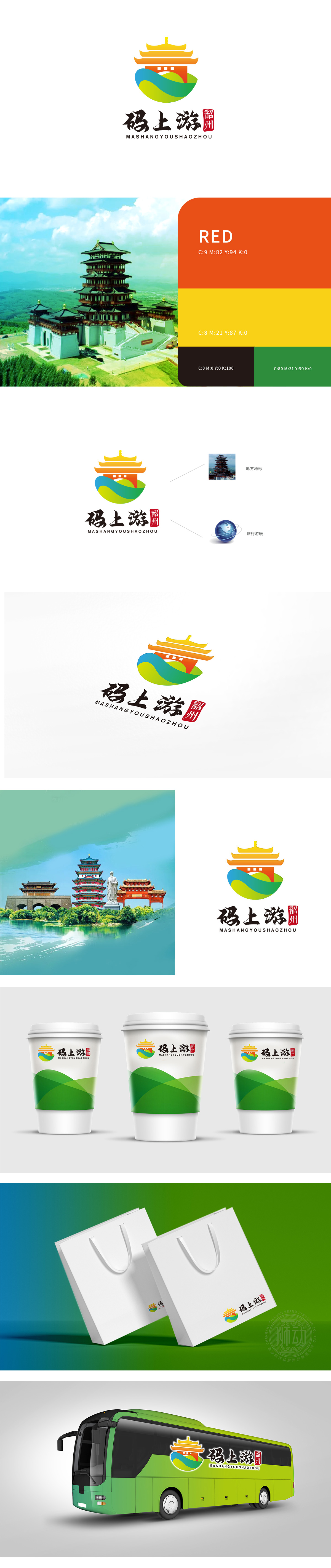
狮动设计采用韶州标志性建筑的重檐形制,用橙黄渐变的色彩处理——既保留了“岭南古邑”的历史厚重感,又通过明亮的色调打破传统建筑的沉闷,符合“旅游”的轻松氛围,像在说“来韶州,看有故事的老建筑”。绿、蓝、黄三色的流动曲线太妙了!绿色对应山的葱郁植被,蓝色像江的蜿蜒水流,黄色呼应土壤或阳光——这是韶州“山水名城”的自然符号,用“流动”的形态暗示“游”的动态感,同时传递“活力旅游”的理念。把“韶州特色”“数字旅游”“服务内核”揉成了有温度、有记忆点的图形语言,每一处细节都在“说话”。
Lion design adopts the double-eaves shape of Shaozhou's landmark buildings, and is treated with orange-yellow gradient colors-it not only retains the historical sense of "Lingnan ancient town", but also breaks the dullness of traditional buildings through bright colors, which is in line with the relaxed atmosphere of "tourism", like saying "come to Shaozhou and see the old buildings with stories". The flow curves of green, blue and Huang San are wonderful! Green corresponds to the lush vegetation of the mountain, blue is like the winding water of the river, and yellow echoes the soil or sunshine-this is the natural symbol of Shaozhou.


扫码或拨打添加客服微信


