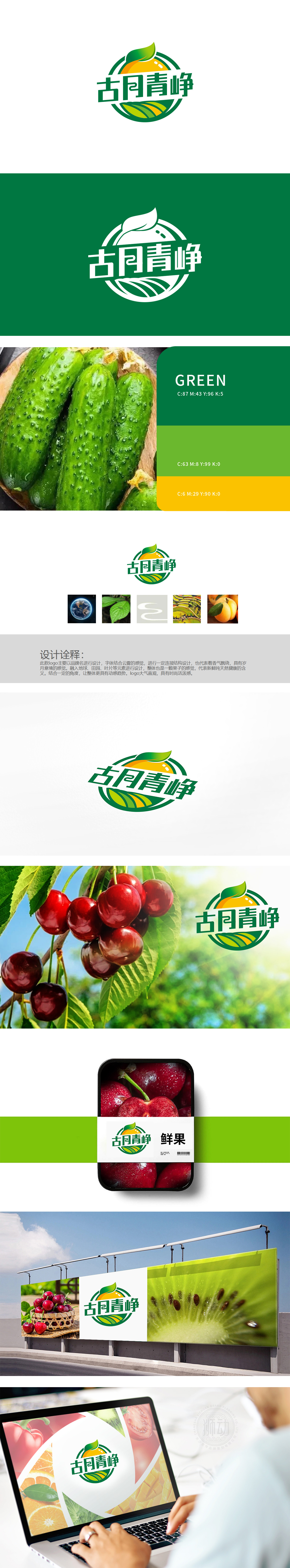
狮动设计以“一颗饱满的果子”为视觉中心,直接对应生鲜水果的“新鲜感”。橙色作为“食欲色”,能瞬间激发消费者对“新鲜果实”的联想,符合生鲜品牌的“引流需求”;果蒂的绿色叶片向上翘起,模拟“果实生长”的动态,强化“生命力”。田园肌理:既强化“农业”属性,又通过“起伏的曲线”带来“风过农田”的动势,让静态LOGO有了“呼吸感”。将“古”与“月”、“青”与“峥”的笔画用曲线连接,模拟“云雾飘绕”的形态。狮动用“图形语言”精准翻译了生鲜农业的“品牌内核”:用“果子”传递“新鲜”,用“田园”传递“农业”,用“叶片”传递“天然”,用“曲线”传递“动势”。
Lion design takes "a full fruit" as the visual center, which directly corresponds to the "freshness" of fresh fruit. As an "appetite color", orange can instantly stimulate consumers' association with "fresh fruit", which meets the "drainage demand" of fresh brands; The green leaves of the pedicel tilt upward, simulating the dynamics of "fruit growth" and strengthening "vitality". Pastoral texture: it not only strengthens the attribute of agriculture, but also brings the momentum of "wind over farmland" through the "undulating curve", which makes the static LOGO have a "breathing feeling". The strokes of "Gu" and "Yue", "Qing" and "Zheng" are connected by curves to simulate the shape of "clouds floating around".


扫码或拨打添加客服微信


