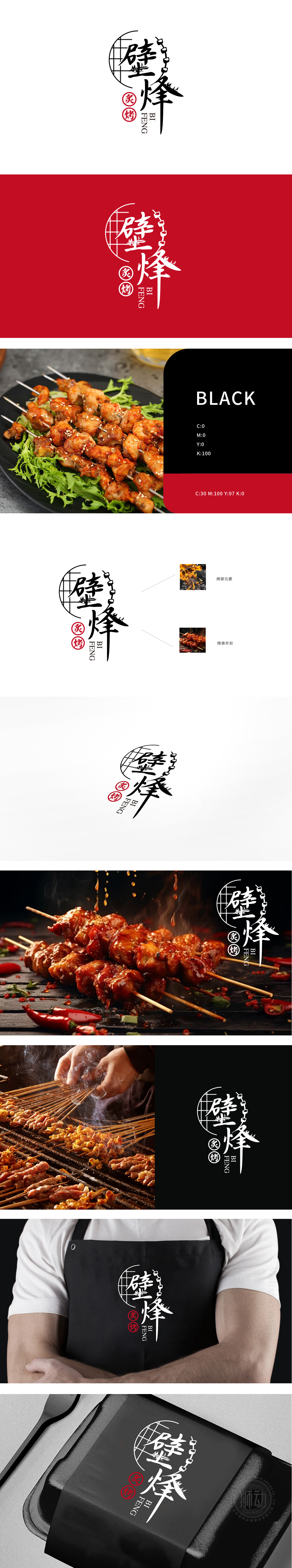
狮动设计采用字形与烤串/烤架元素的融合,“壁”字的“烤架化”处理:左侧“壁”字的左半部分,用半圆形网格纹理替代了传统“壁”字的左部结构,直接关联烤串的核心工具——烤架,强化“烧烤”的行业属性。“峰”字的“烤串化”延伸,暗合烤串“串成一串”的外形特征。整体用“餐饮场景的核心符号”重构“品牌名称的视觉形态”,让消费者看到logo的瞬间,就能通过图形联想出“烤串店”的场景、以及“接地气但有质感”的品牌调性。
Lion design adopts the fusion of glyph and kebab/grill elements, and the word "wall" is "grilled": the left half of the word "wall" on the left side replaces the left structure of the traditional word "wall" with semi-circular grid texture, which directly relates to the grill, the core tool of kebabs, and strengthens the industrial attribute of "barbecue".The word "Feng" is an extension of skewering, which coincides with the appearance characteristics of skewering. Reconstruct the "visual form of brand name" with the "core symbol of catering scene" as a whole.


扫码或拨打添加客服微信


