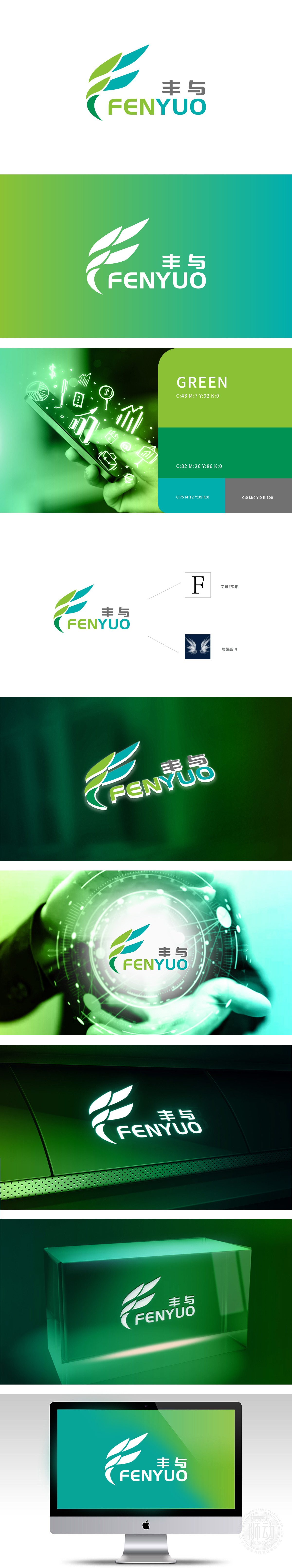
狮动设计以渐变叶片/翅膀为核心,采用绿色/蓝色的自然过渡:绿色象征“生机、丰茂”,叶片的舒展形态像萌芽的种子,传递“向上生长”的动态感;蓝色则延伸出“包容、科技”,翅膀的轮廓又暗含“突破、飞翔”的意味——这种“自然生长+科技赋能”的符号组合,完美契合了互联网行业“活力、创新、连接”的属性,同时也为“丰与”品牌注入了“丰富多元、协同共进”的联想。 整个设计的“轻量化”与“符号化”完全贴合互联网传播的“短平快”核心需求,能在3秒内让用户记住品牌名称与核心视觉符号。
Lion design takes the gradual change of blades/wings as the core and adopts the natural transition of green/blue;Green symbolizes "vitality and abundance", and the stretching form of leaves is like budding seeds, conveying the dynamic sense of "upward growth"; Blue extends "tolerance and technology", and the outline of wings implies the meaning of "breakthrough and flying"-this symbol combination of "natural growth+technological empowerment" perfectly fits the attributes of "vitality, innovation and connection" in the Internet industry, and at the same time injects the association of "richness, diversity and cooperation" into "Fenghe" brand.


扫码或拨打添加客服微信


