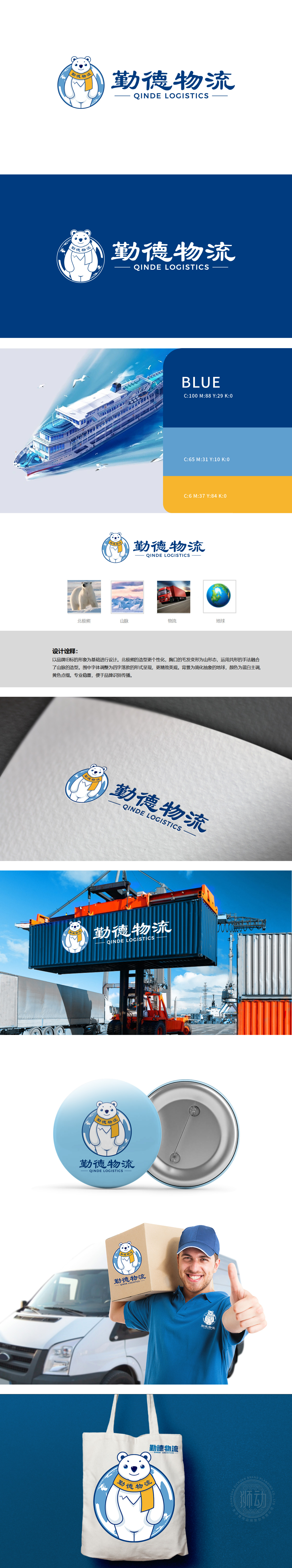
狮动设计采用北极熊站立姿态,增加“活力感”与“亲近感”,更符合物流品牌“主动服务”的调性;细节:胸口的“毛发”被抽象为山脉形态(共形手法),这是设计的“神来之笔”——既保留了北极熊的生物特征,又自然融入了“山脉”元素,实现了“1+1>2”的符号叠加:山脉:象征“稳定”“广阔”,暗示物流服务的“覆盖性”(穿越山脉、连接地域);北极熊+山脉:形成“自然与品牌”的强关联,“依托自然地域优势”服务的可靠性”。logo以北极熊为超级符号,串联起“山脉→物流→地球”三大辅助符号,既保留了品牌的“原生印象”(如北极/山脉可能关联品牌起源或服务地域),又延伸了“行业属性”(物流卡车)与“未来格局”(地球)。
Lion design adopts polar bear standing posture, which increases the sense of "vitality" and "closeness", which is more in line with the tonality of "active service" of logistics brands; Details: the "hair" on the chest is abstracted into the shape of mountains (conformal technique), which is an ingenious design-it not only retains the biological characteristics of polar bears, but also naturally incorporates the elements of "mountains", realizing the symbol superposition of "1+1 > 2": mountains: symbolizing "stability" and "vastness", suggesting the "coverage" of logistics services. Polar bear+mountain range: form a strong connection between "nature and brand" and "rely on the advantages of natural region" for the reliability of service.


扫码或拨打添加客服微信


