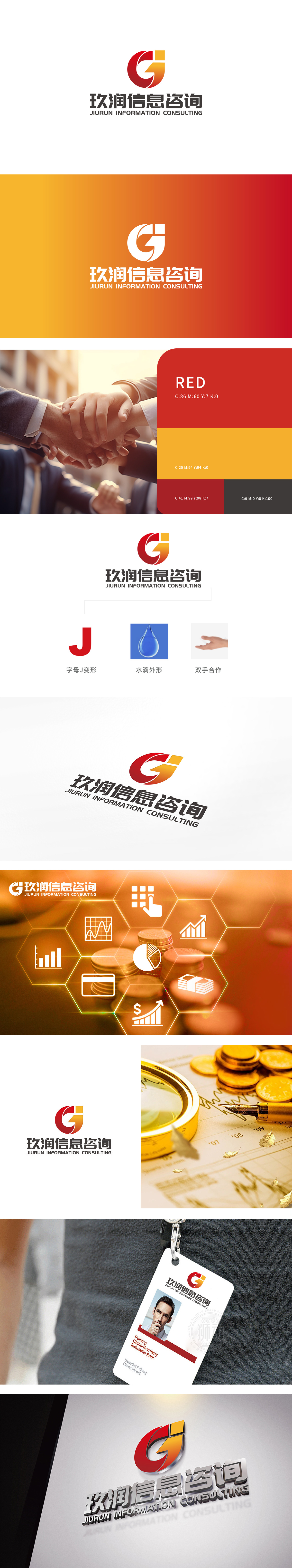
狮动设计将抽象的品牌属性转化为可感知的视觉符号,字母J变形,通过圆润的曲线与倾斜角度,暗示“咨询服务的灵活性与创新性”。水滴外形:传递“精准、凝聚、滋养”特性,完美对应了商业咨询的核心价值——像水滴一样,将零散的信息整合为精准的决策建议,为客户提供“滋养型”服务(帮助客户解决问题、实现成长)。每一个元素都像“商业故事的章节”,串联起客户对“玖润信息咨询”的认知:这是一家“有活力、够专业、重合作”的咨询公司。
Lion design transforms abstract brand attributes into perceptible visual symbols, and the letter J is deformed, implying "flexibility and innovation of consulting services" through rounded curves and inclined angles.Droplet shape: it conveys the characteristics of "precision, cohesion and nourishment", which perfectly corresponds to the core value of business consulting-like a drop of water, it integrates scattered information into accurate decision-making suggestions and provides "nourishing" services to customers (helping customers solve problems and achieve growth).


扫码或拨打添加客服微信


