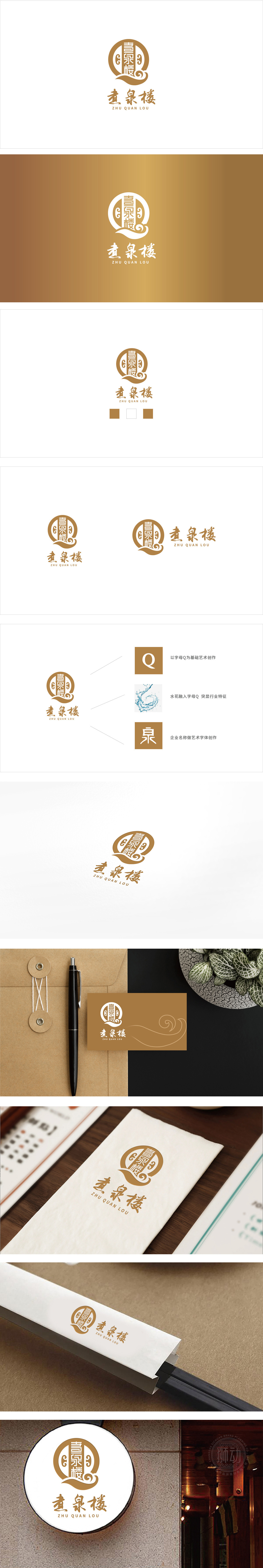
狮动设计将“煮泉”主题的具象化,以传统排版的经典方式更用“煮泉”二字点出餐饮的“匠心”——煮泉意味着“慢熬”,暗示餐厅对食材、工艺的用心。两侧对称云纹:左右呼应的卷云纹,是中式吉祥符号的代表(象征“高升、祥瑞”),同时模拟“泉气升腾”的场景,让“煮泉”的画面更具画面感;波浪纹的“流动感”也暗示“新鲜”,符合食客对餐饮“干净、鲜活”的期待。用“具象化的传统元素”讲“餐饮的故事”:圆形对应“聚”,云纹对应“吉”,波浪纹对应“鲜”,书法体对应“文”,每一处都在传递“中式餐饮”的核心价值——不仅是吃饭,更是一种“团圆的仪式”、“匠心的体验”、“文化的共鸣”。
Lion Design makes the theme of "Boiling Spring" concrete, and uses the word "Boiling Spring" in the classic way of traditional typesetting to point out the "ingenuity" of catering-boiling spring means "slow cooking", suggesting the restaurant's intention to ingredients and technology. Symmetrical moire patterns on both sides: Cirrus moire patterns echoing left and right are the representatives of Chinese auspicious symbols (symbolizing "Gao Sheng and Xiang Rui"), and at the same time simulate the scene of "spring rising" to make the picture of "boiling spring" more vivid; The "fluidity" of the wavy pattern also implies "freshness", which is in line with diners' expectation of "clean and fresh" dining.


扫码或拨打添加客服微信


