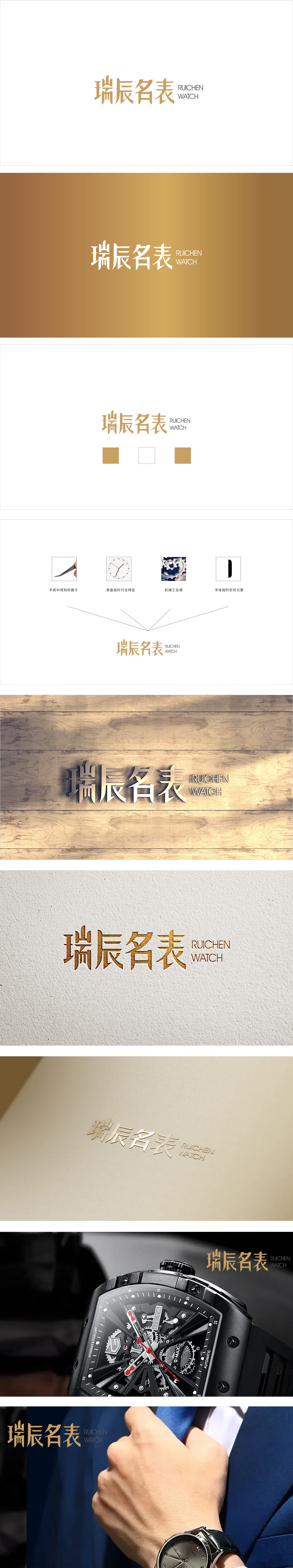
狮动设计采用定制化无衬线字体,既保持现代感,又强化了品牌联想:字体整体呈“挺拔感”,均采用圆润但不失力度的弧度,类似钟表指针的流畅感;“表”字的结构,模拟了钟表表盘的刻度排列,直接关联“名表”的核心产品属性。主色:浅金/香槟金:金色是名表品牌的“经典色”,象征高端、品质与永恒。用“视觉语言”直接传递品牌核心价值,定制化的“差异化壁垒”。
Lion design adopts customized sans serif fonts, which not only maintains the modern sense, but also strengthens the brand association: the fonts are "straight and straight" as a whole, and all adopt rounded but vigorous radians, similar to the smooth sense of clock hands; The structure of the word "watch" simulates the scale arrangement of the watch dial and is directly related to the core product attributes of "famous watch".


扫码或拨打添加客服微信


