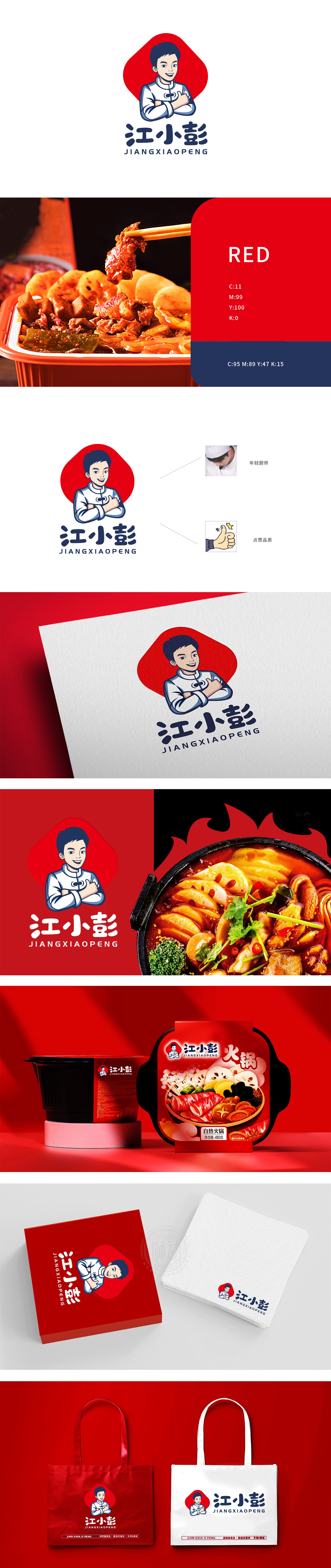
狮动设计用“人物IP+文化符号”建立强认知,主视觉的核心是年轻厨师形象,这一设计直接关联“方便食品”的底层需求——“像家里做的一样”的专业感:穿着带盘扣的白大褂,短发、微笑、抱臂的姿势,既有厨师的专业感,又像邻居家的“小彭”,亲切得像帮你做饭的朋友,完美匹配“方便食品=快捷但有温度”的消费期待;采用不规则的“印章式”红底,像传统美食的“印记”,既呼应中国餐饮文化的“热闹感”,又通过高饱和度颜色抓住注意力,让“江小彭”不再是一个“名字”,而是一个“有故事、有温度的朋友”,在“快捷”之外,给消费者“家的感觉”。
Lion design uses "people's IP+ cultural symbols" to build strong cognition, and the core of the main vision is the image of a young chef. This design is directly related to the bottom demand of "convenience food"-the professional sense of "cooking at home": wearing a white coat with buttons, short hair, smiling and holding arms, which not only has the professional sense of the chef, but also looks like a neighbor's "Xiao Peng" and is as kind as helping you cook. The irregular "seal-like" red background, like the "imprint" of traditional cuisine, not only echoes the "lively feeling" of China catering culture, but also captures attention through high saturation colors, so that "Jiang Xiaopeng" is no longer a "name" but a "friend with a story and temperature".


扫码或拨打添加客服微信


